Book & Print Design
Designed with Adobe Indesign, Photoshop & Illustrator
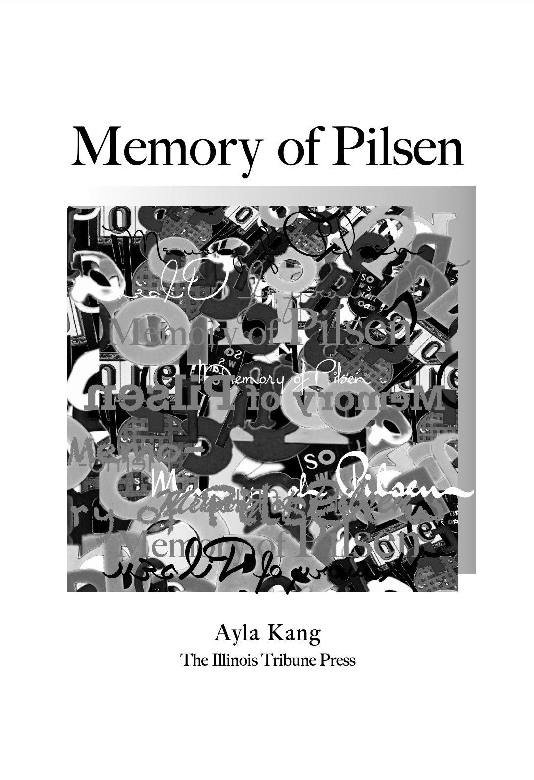
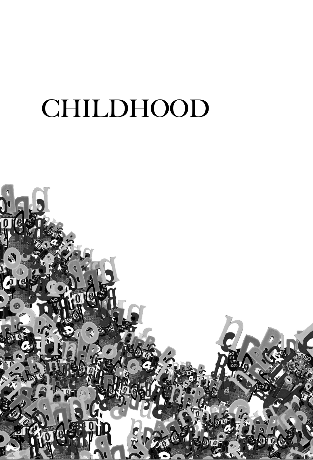
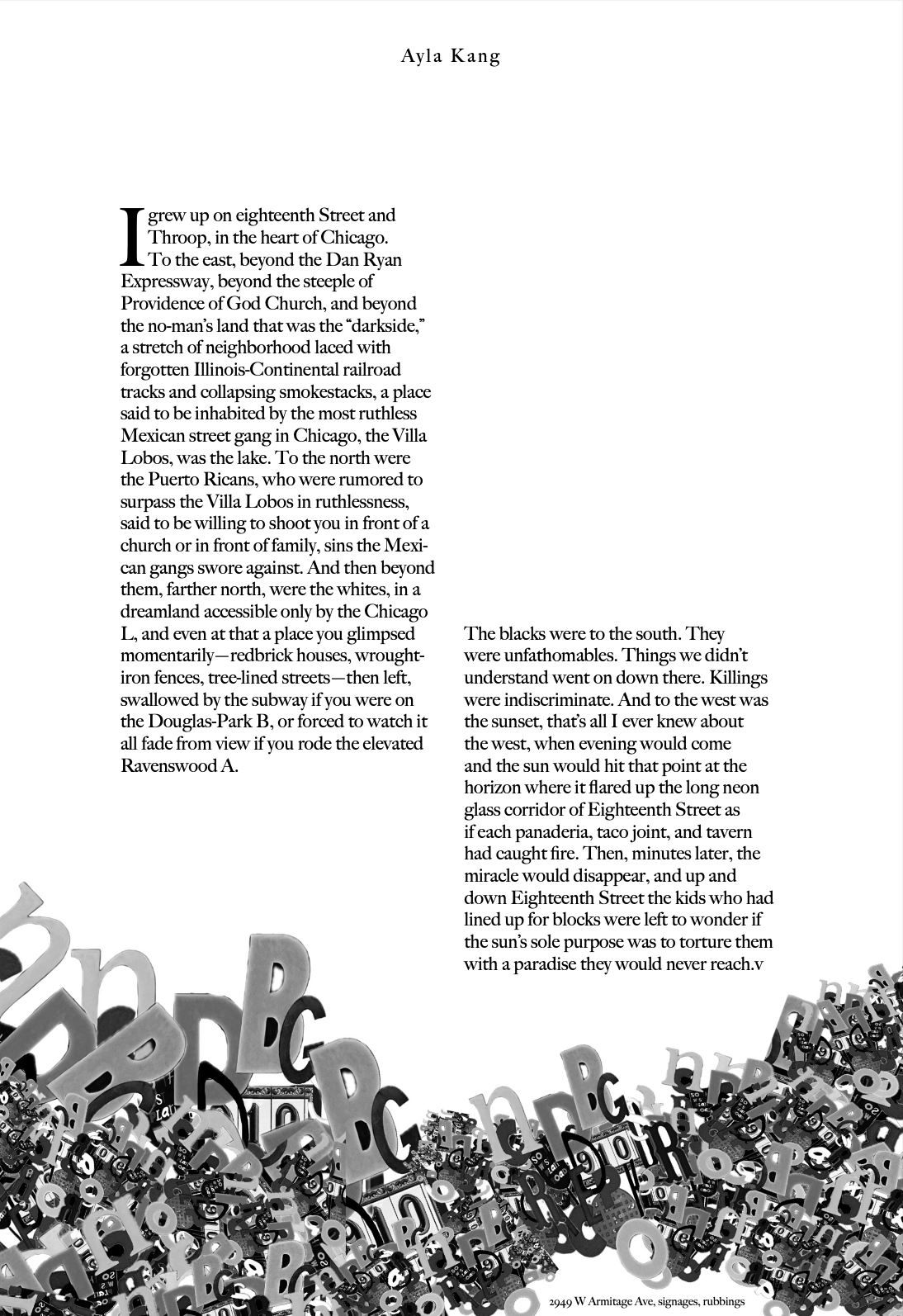
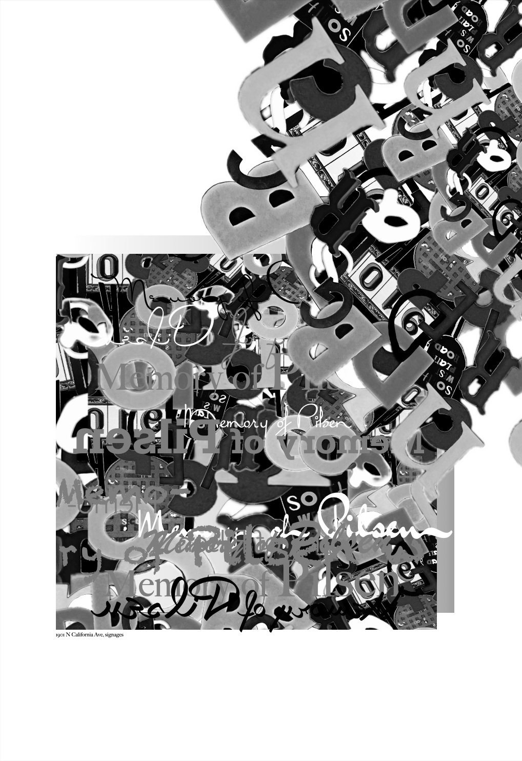
Memory of Pilsen
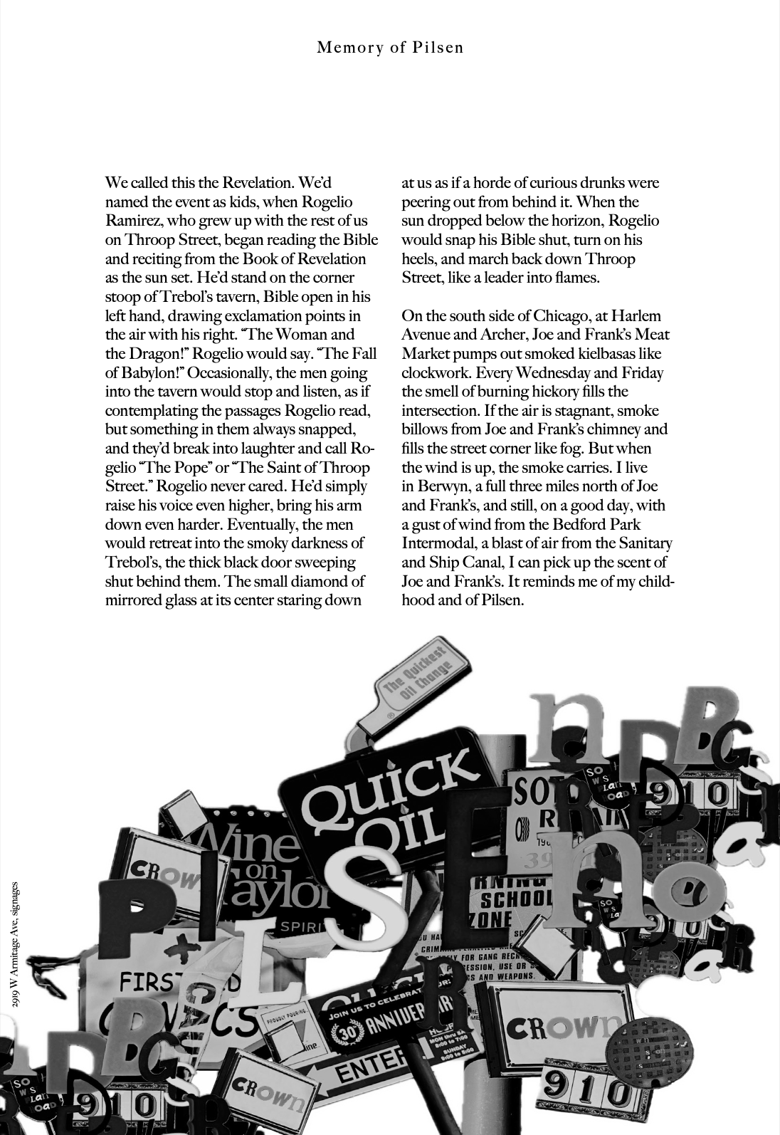
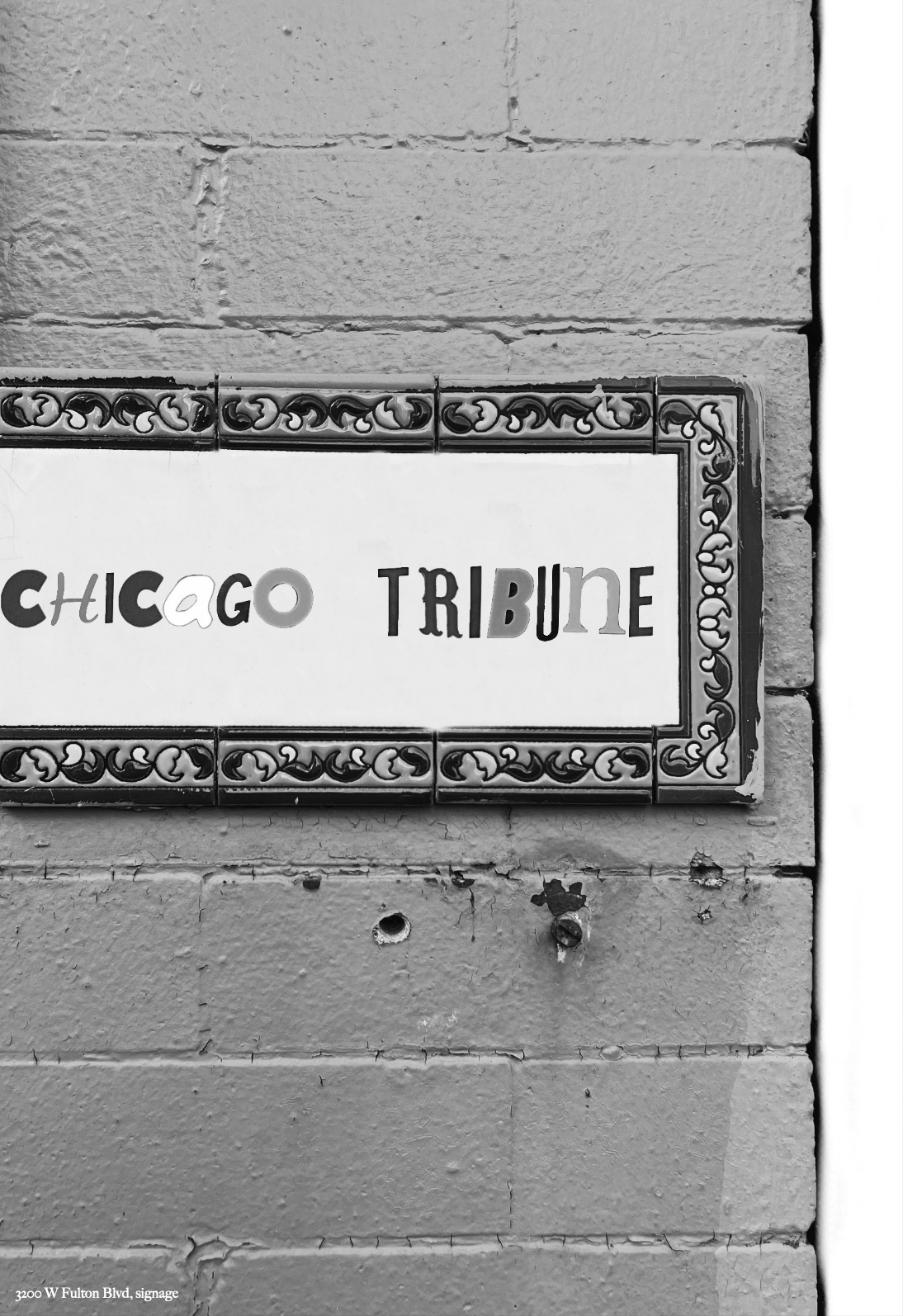
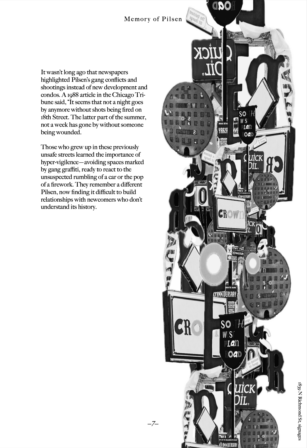
This book explores the typography and visual identity of Logan Square, Chicago, through image-making and book design. Using text excerpts about Chicago’s history, I documented typographic elements found in the neighborhood, including signage, commercial lettering, and municipal type. I pulled individual letters from various signs, capturing each letter through photography and cutting them out to create unique compositions. Significant words were extracted from each page and reconstructed into new signs using these letters. These sign collages were then further arranged into larger collages to form the imagery for each page. The final book integrates these elements into a cohesive design, emphasizing the aesthetic and structural aspects of typography while reflecting both historical and personal narratives of Logan Square.


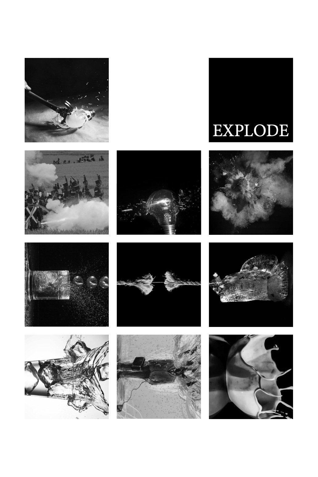
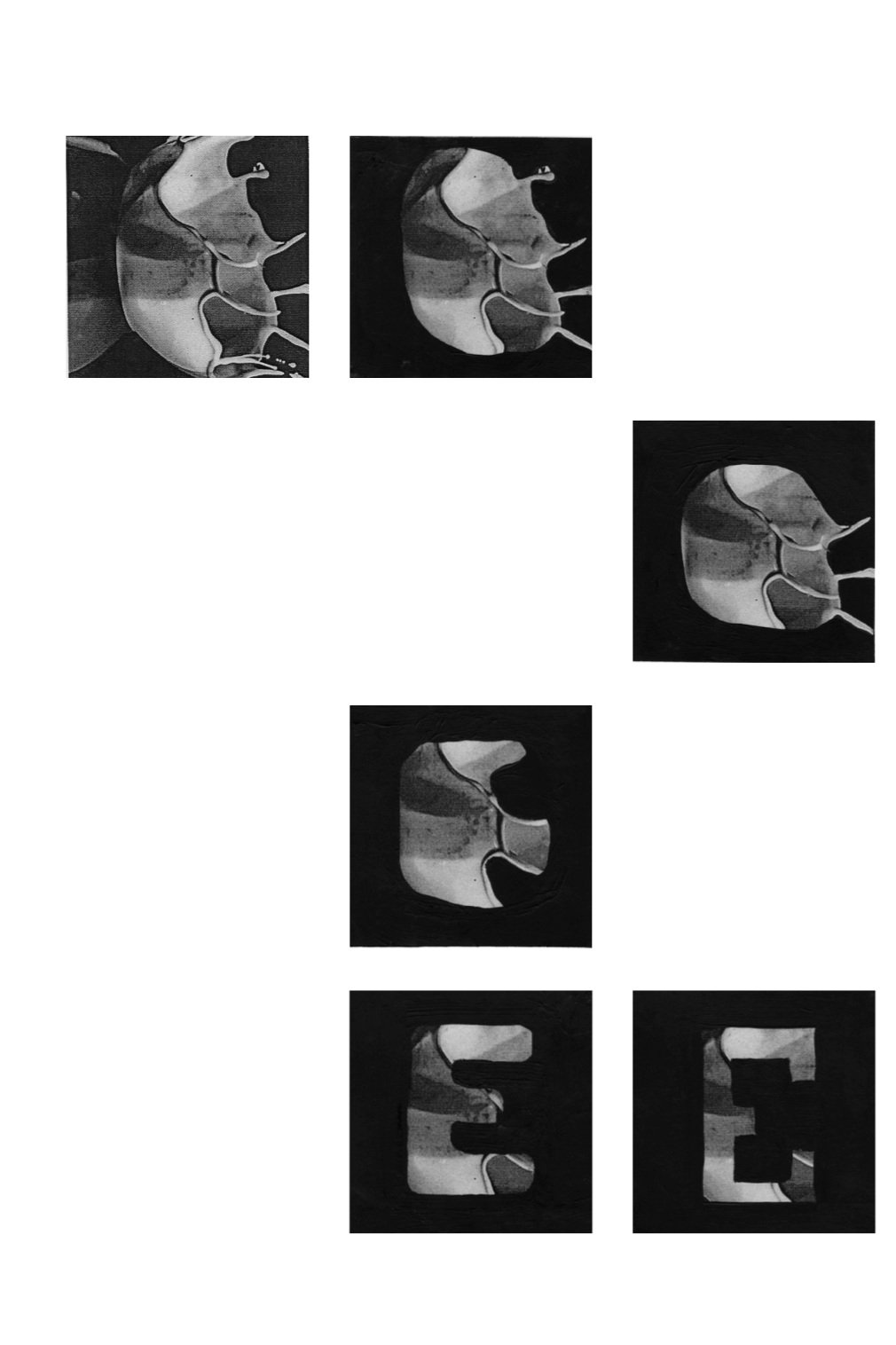
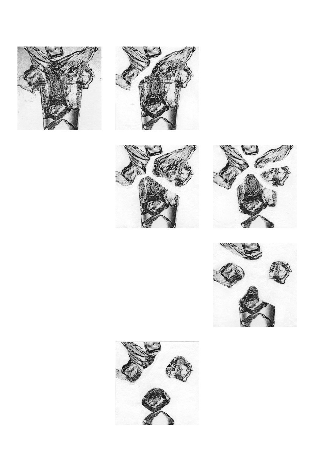
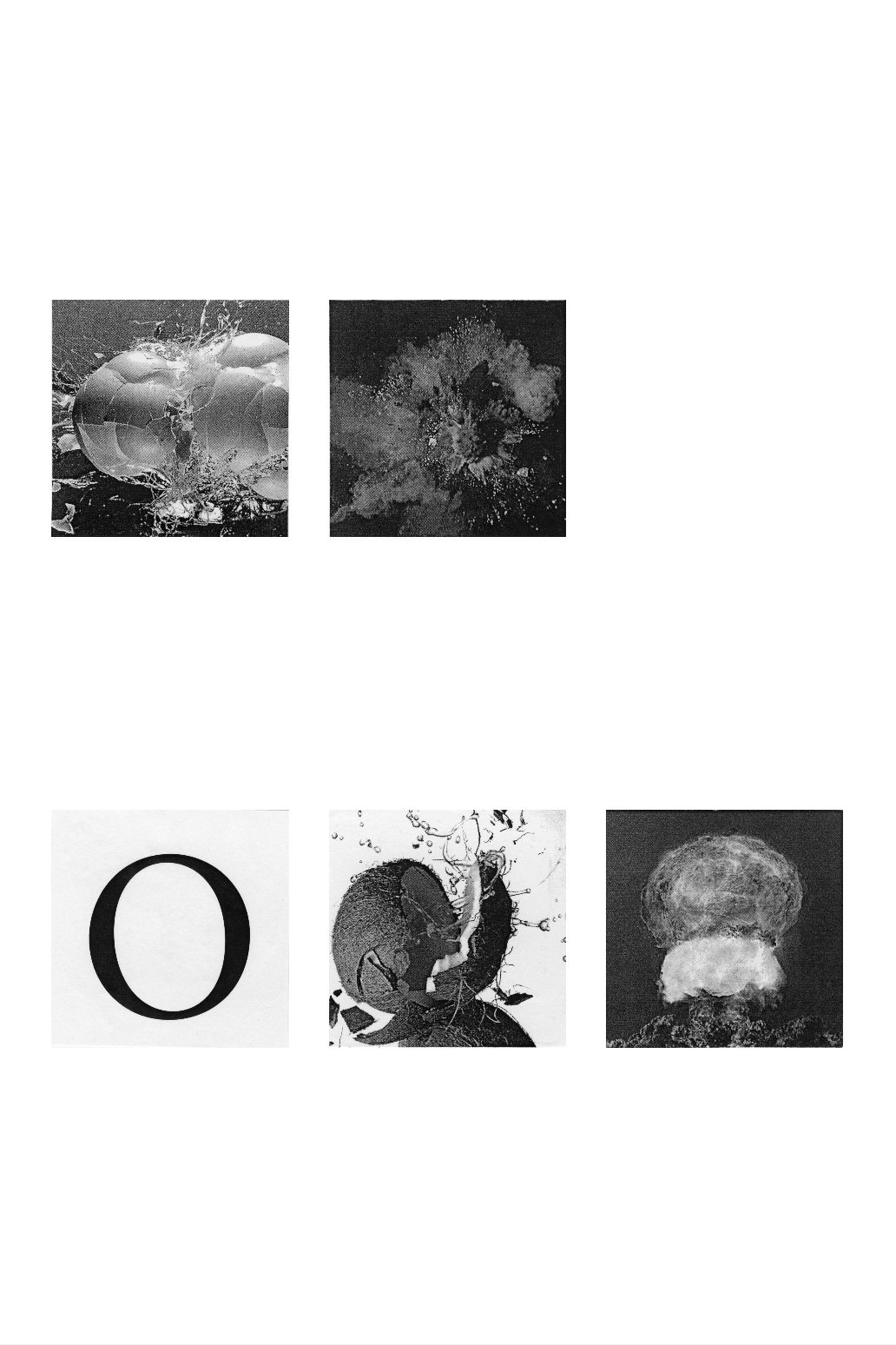
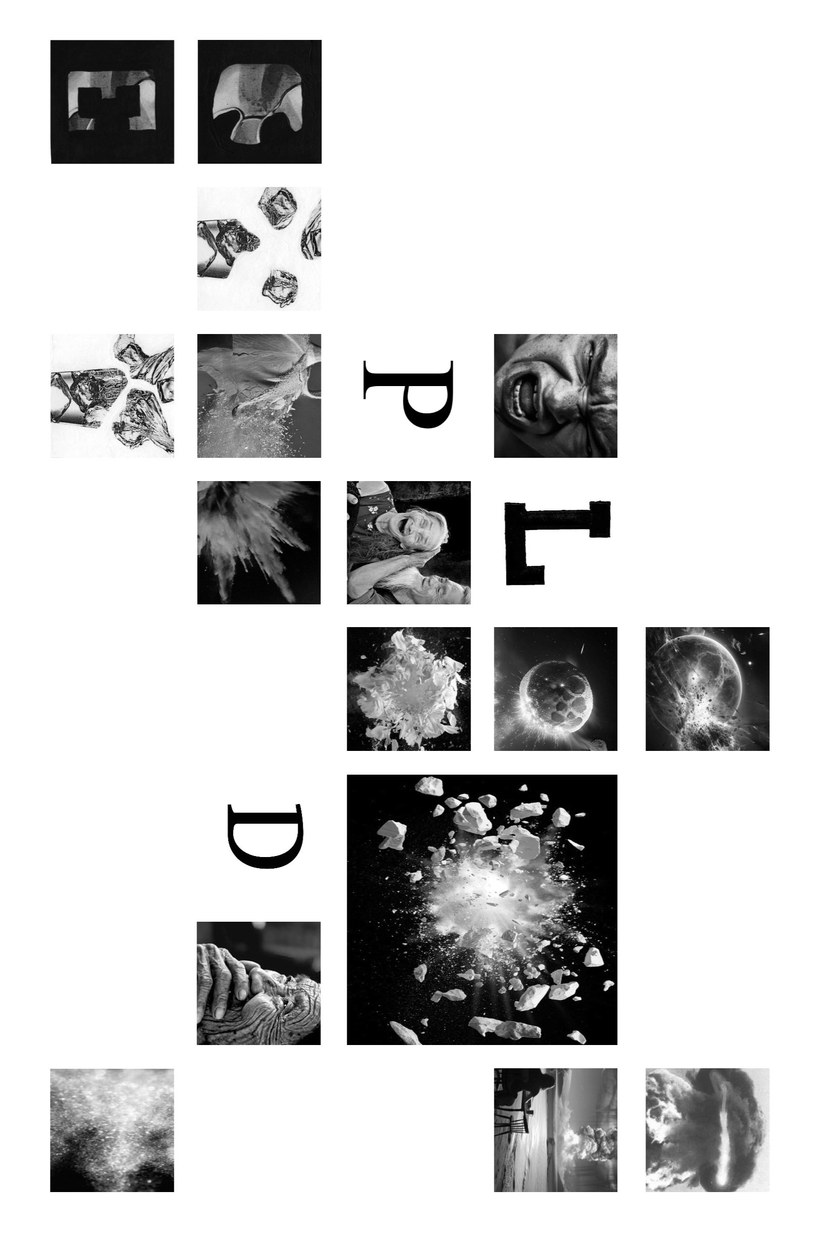
Story Matrix: Explode
This project explores the action word explode through a 12-panel sequence, using typography and imagery to capture its intensity and motion. Hand-drawn illustrations, manipulated found images, and fragmented letterforms create bursts of energy and impact. By distorting type and creating dynamic transitions, I constructed a 30 x 20-inch composition that conveys the buildup, detonation, and aftermath of an explosion through bold visual storytelling.


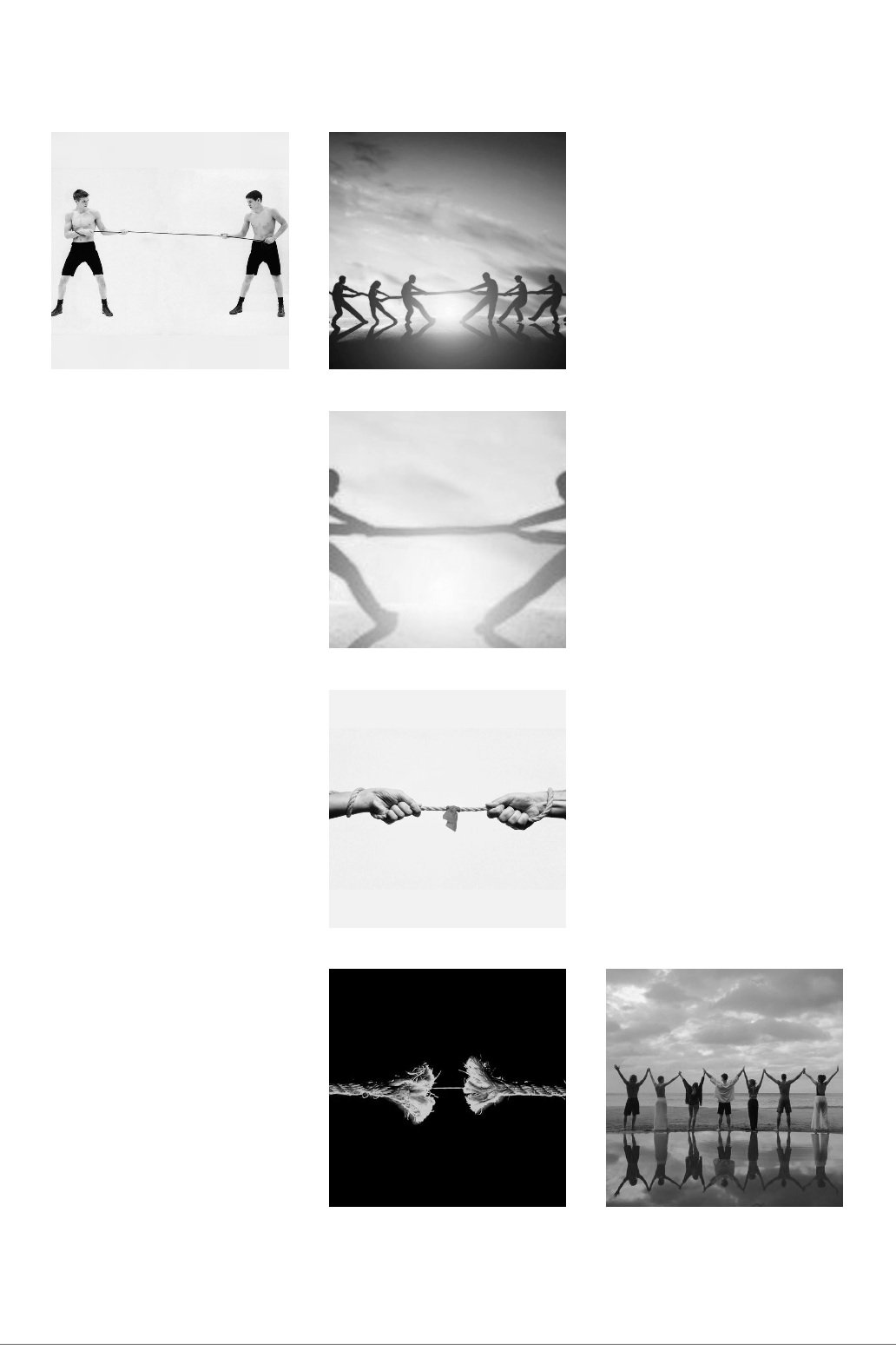


Hierarchy and Structure
This project explores page arrangement, hierarchy, and grid structure through the design of six typographic announcements. The focus was on creating structured layouts that balance clarity and visual interest, using contrast, spacing, and alignment to establish emphasis and order. Through structured exercises, I analyzed typographic hierarchy, experimented with spatial relationships, and refined compositions to enhance readability and impact. The final set of announcements demonstrates how strategic typographic choices influence communication and visual engagement.


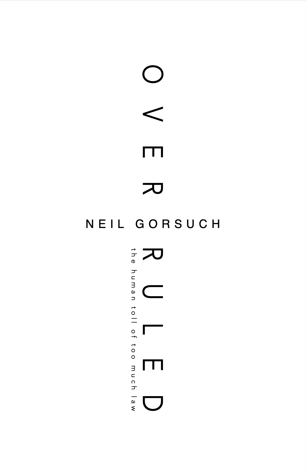
Over Ruled
This project explores typographic hierarchy, spacing, and structure through the design of 4 book covers. Each cover experiments with variations in spacing, weight, and size to establish emphasis and meaning. The process involved creating multiple layouts that highlight either the book title or the author’s name while maintaining clarity and visual impact. Through structured exercises, I explored how typography influences perception and readability, demonstrating how simple typographic changes can alter the way a message is communicated.