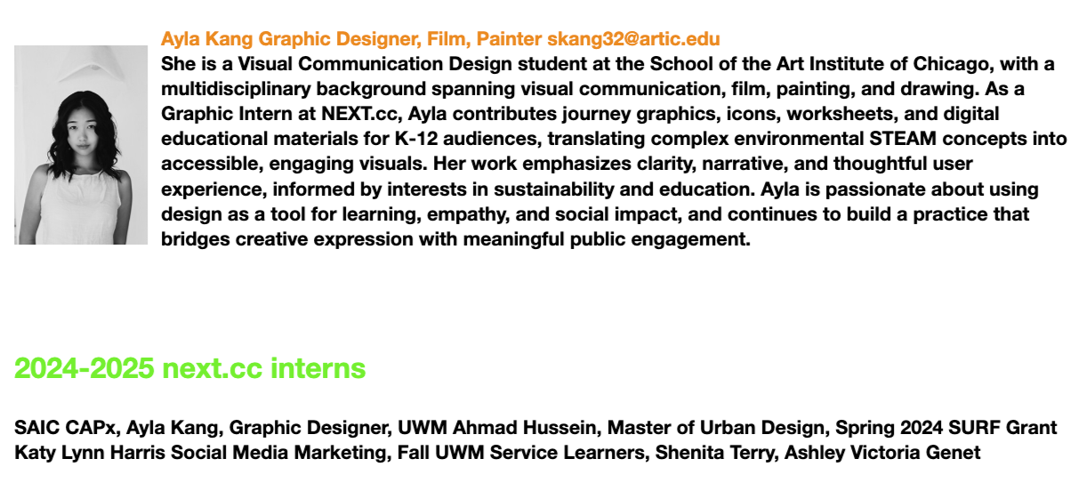
AYLA KANG
SCHOOL OF THE ART INSTITUTE OF CHICAGO
Bachelor of Fine Arts (BFA) in Visual Communication
Minors in Painting & Drawing, Sculpture, Film & Photography
Chicago, IL | +1(312) 447-1846 | skang32@artic.edu | www.linkedin.com/in/ayla-kang
Internships
NEXT.cc
Summer Internship 2025 - Spring Internship 2026
About NEXT.cc
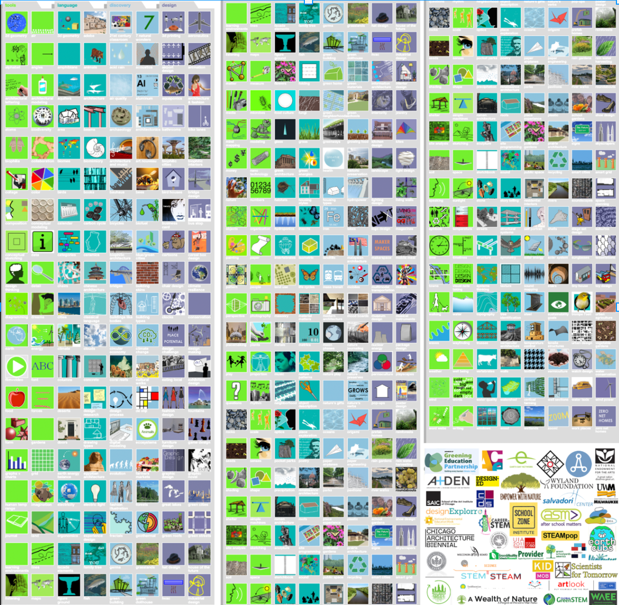
NEXT.cc is an educational non-profit organization dedicated to inspiring young minds through design and environmental education. Their mission is to integrate STEAM learning into schools and communities by providing creative, accessible, and interactive resources that encourage exploration and sustainable thinking.
During my internship at NEXT.cc, I created a wide range of educational materials, including student worksheets, instructional posters, illustrations, and interactive guides. I also produced nature preservation videos and curated engaging visual content that combined painting, drawing, and graphic design skills. My work supported the organization’s goal of making complex environmental concepts accessible and exciting for young learners.
Link to website: https://www.next.cc/
Discovers Children's Museum
Aberdeen Entertainment Co.
Summer Internship 2024

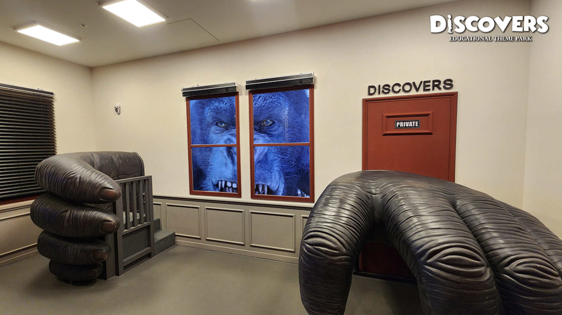


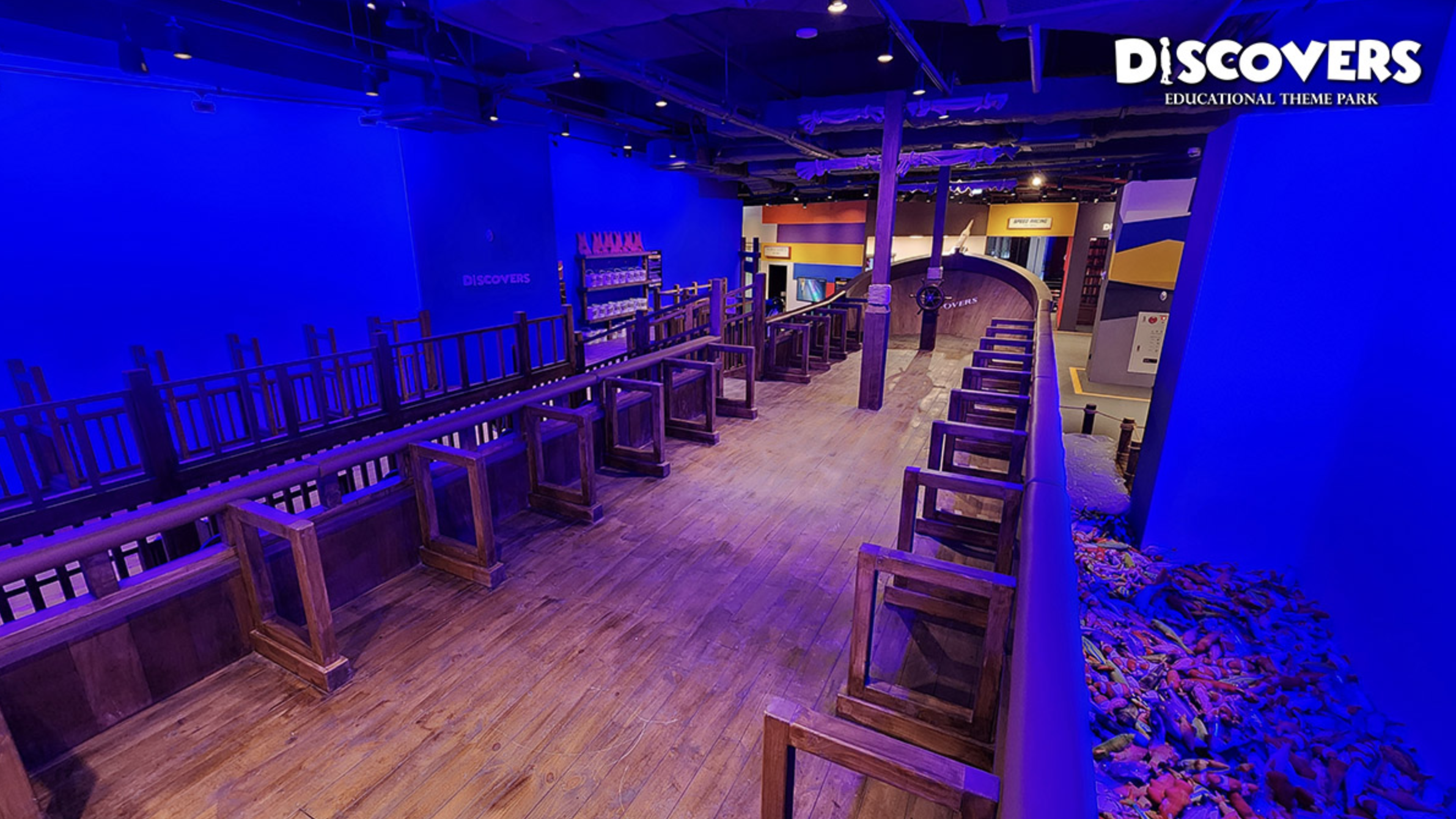

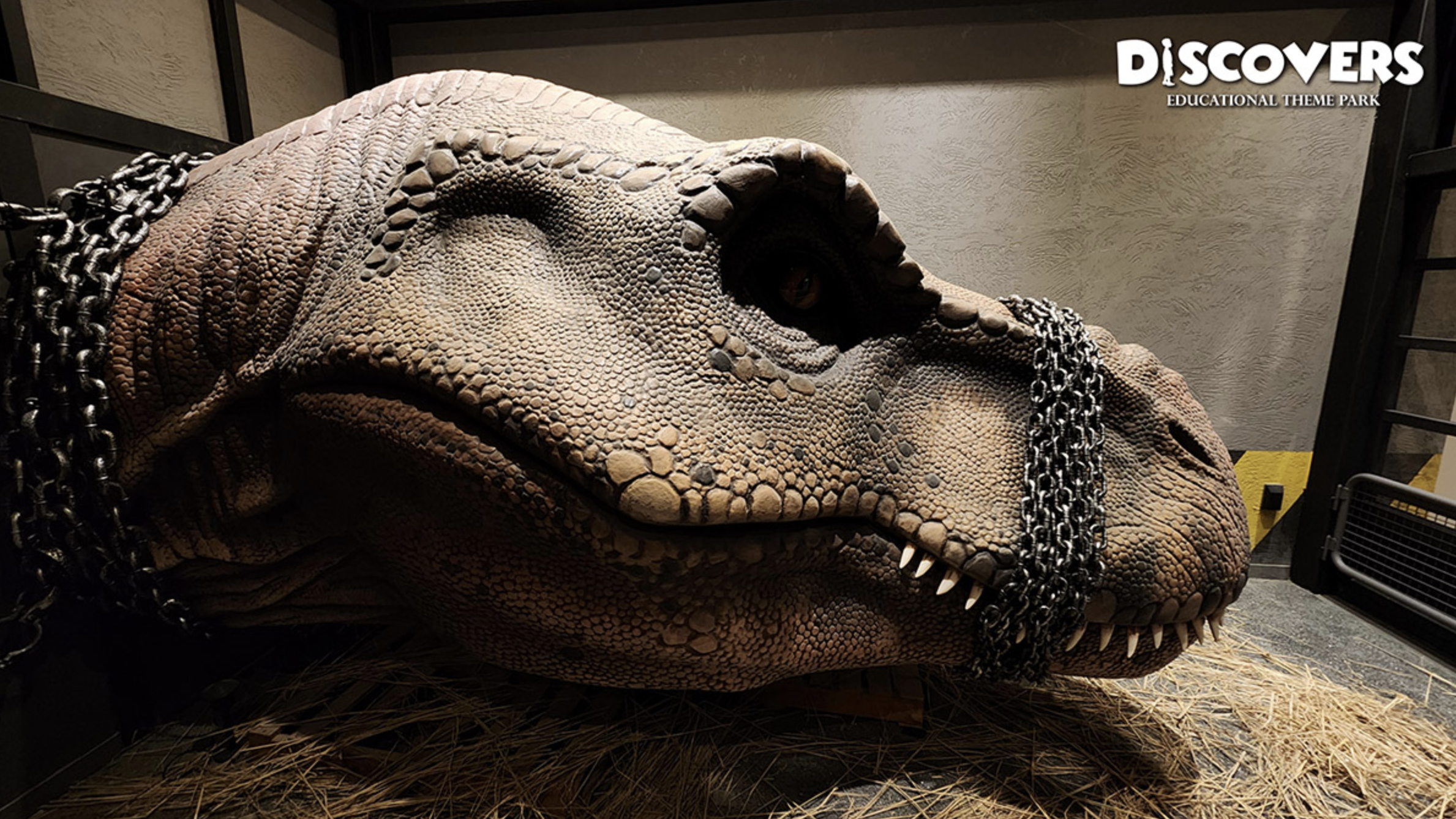
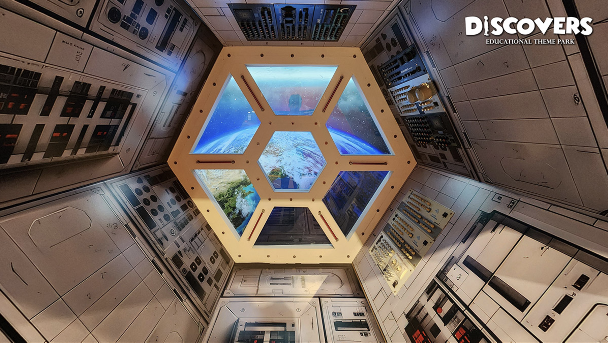
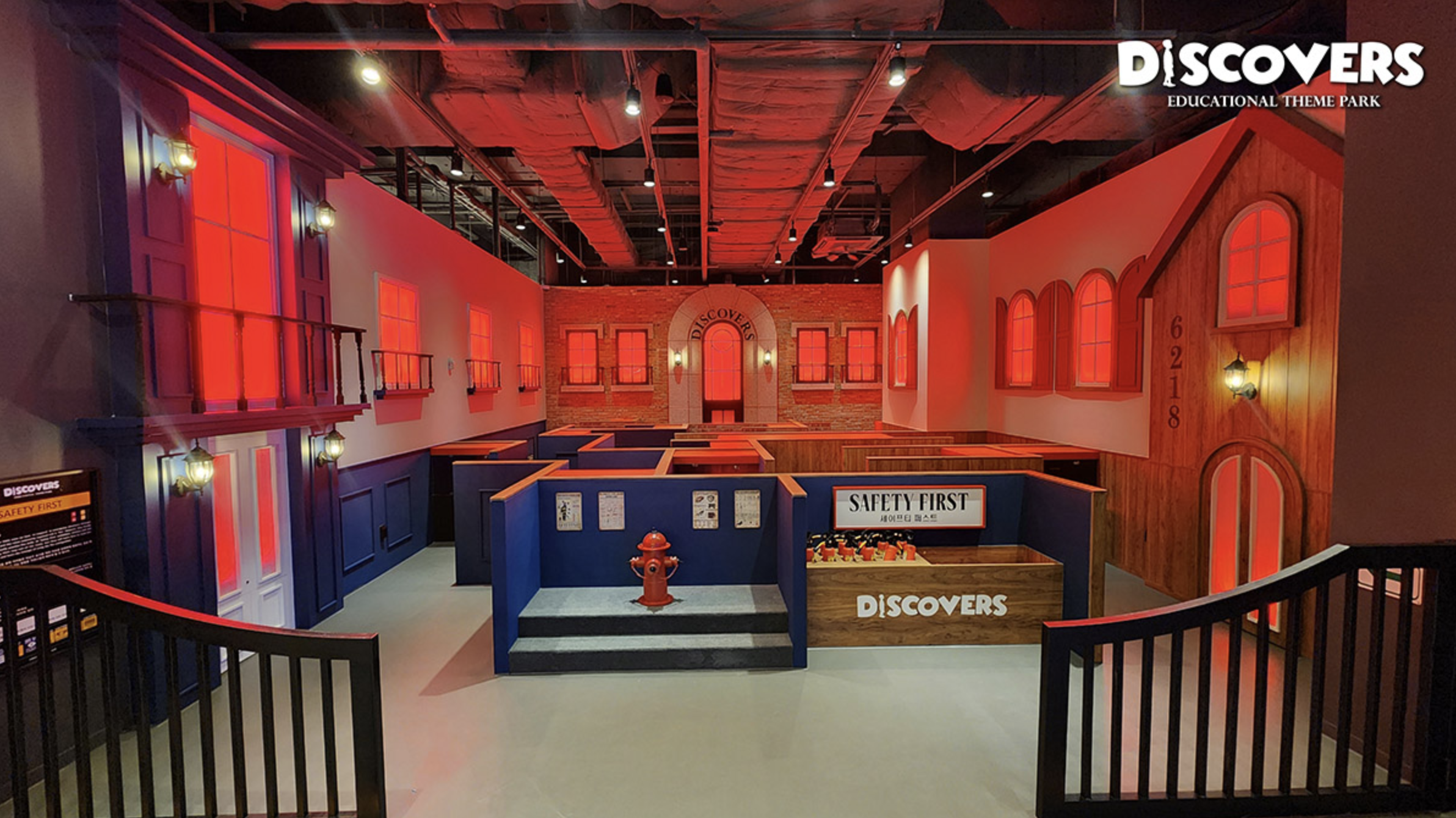


About Aberdeen
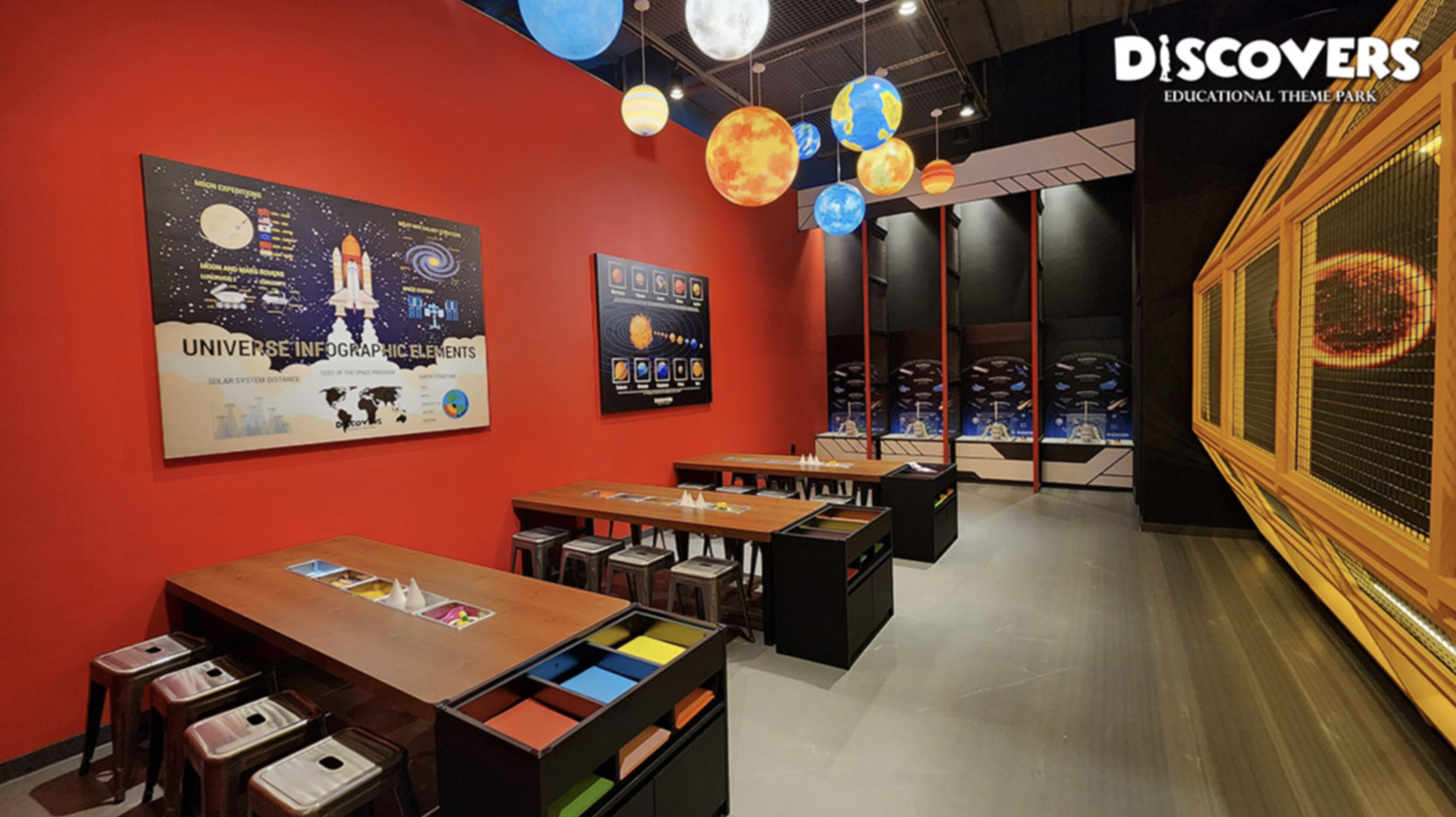
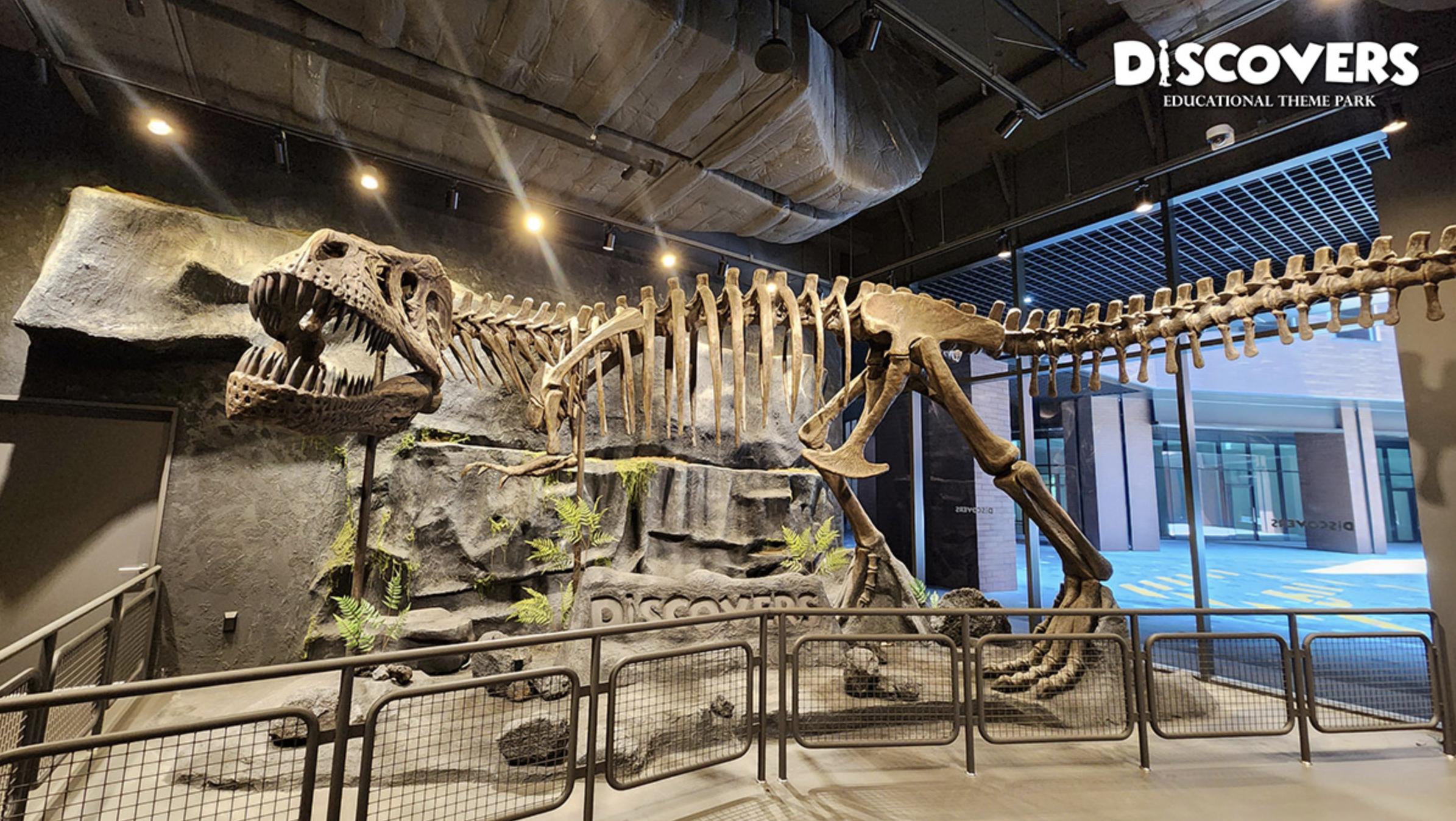
Discovery Children's Museum, developed and operated by Aberdeen Entertainment Co., is an educational theme park that integrates STEM learning with interactive play, providing children with a dynamic and immersive environment
During my internship at the museum, I assisted with design reviews and display installations. I reviewed and modified graphic samples for production, evaluated sample prints for color accuracy, and adjusted lighting for consistency. In the final installation phase, I supported inspections to ensure proper alignment and execution of designs.
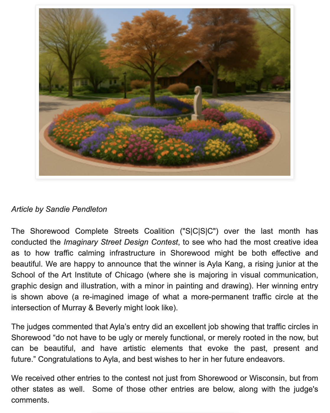
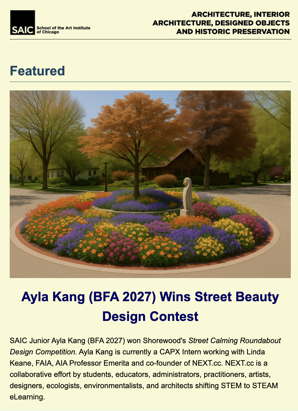
Imaginary Street Beauty Design Contest 2025
First Place
I was awarded First Place in the Imaginary Street Beauty Design Contest, an independent community competition organized by the Shorewood Complete Streets Coalition and Greater Shorewood Bikers. This was not a school assignment, but a public design initiative inviting participants to propose a new vision for the neighborhood roundabout at Murray & Beverly. My winning proposal was featured in a published article highlighting the selected design, and I was also recognized in my school’s newsletter following the announcement. The concept combined traffic-calming infrastructure with a sculptural and sustainable approach, including the transformation of the central feature into a solar-powered element. The design has moved forward into implementation as part of a larger neighborhood redevelopment effort valued at approximately $300,000. This project reflects my interest in bridging visual communication, public space, and functional urban design through work that exists beyond the classroom and engages directly with real communities.
Link to article: https://shorewoodbikers.blogspot.com/
Visual Communication
Designed with Adobe Indesign & Illustrator
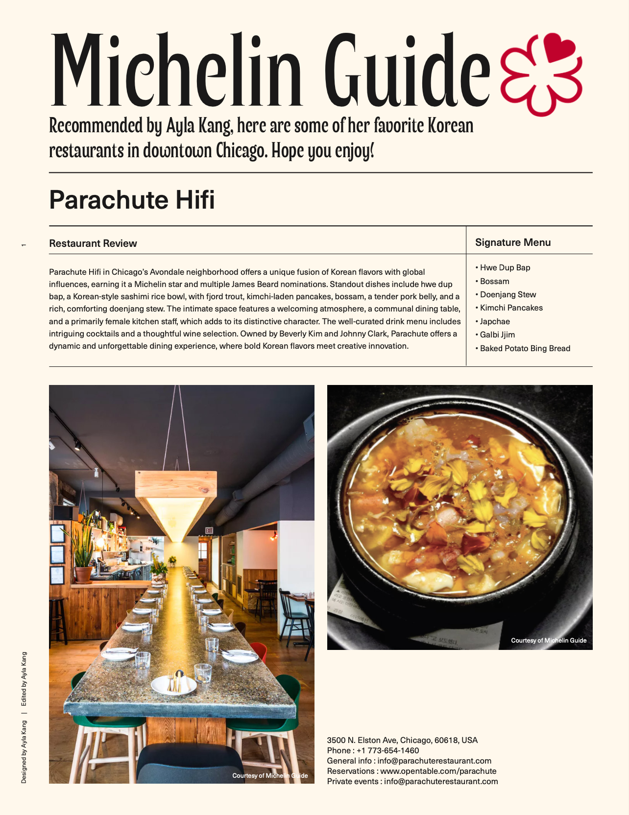


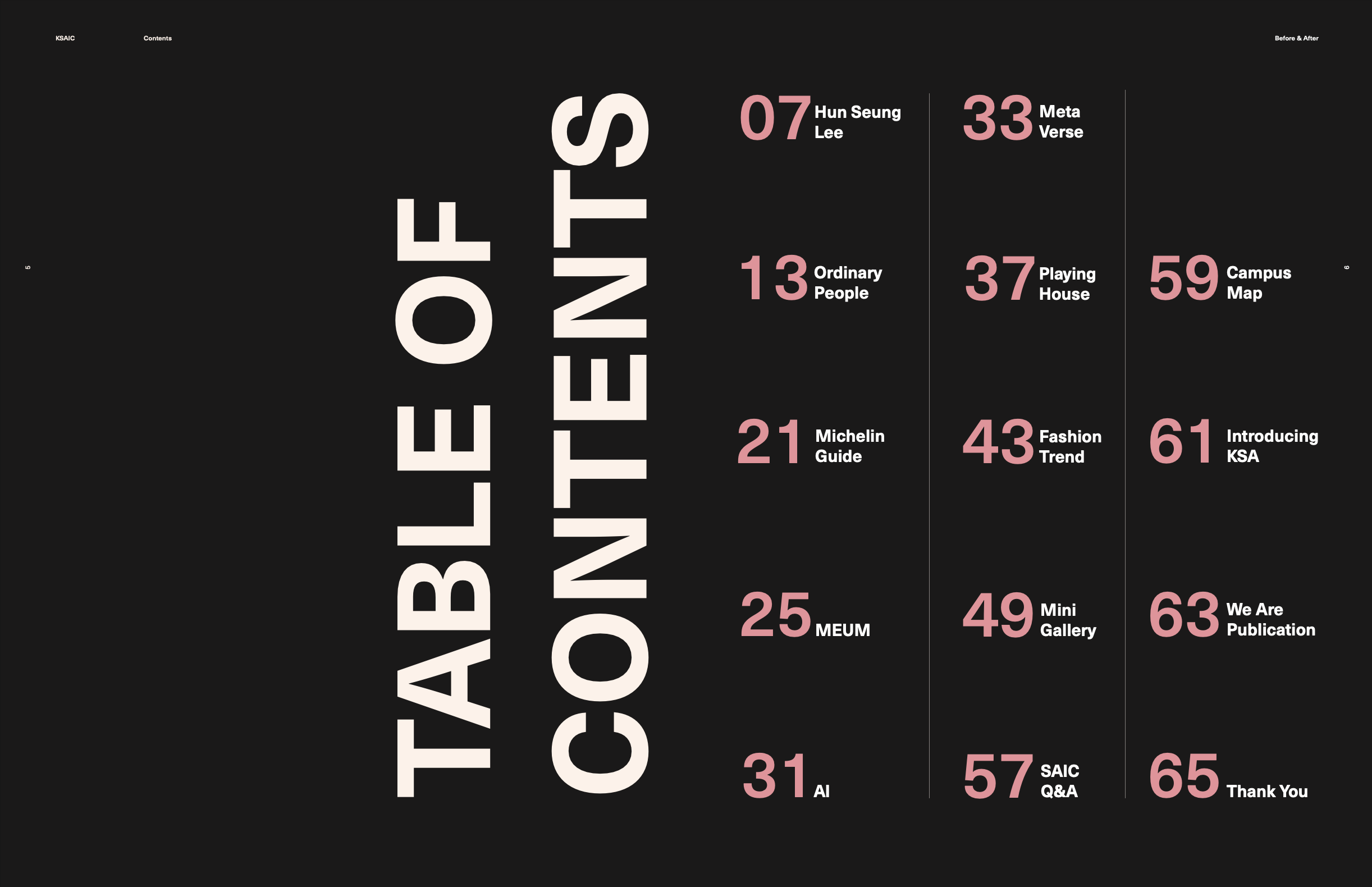
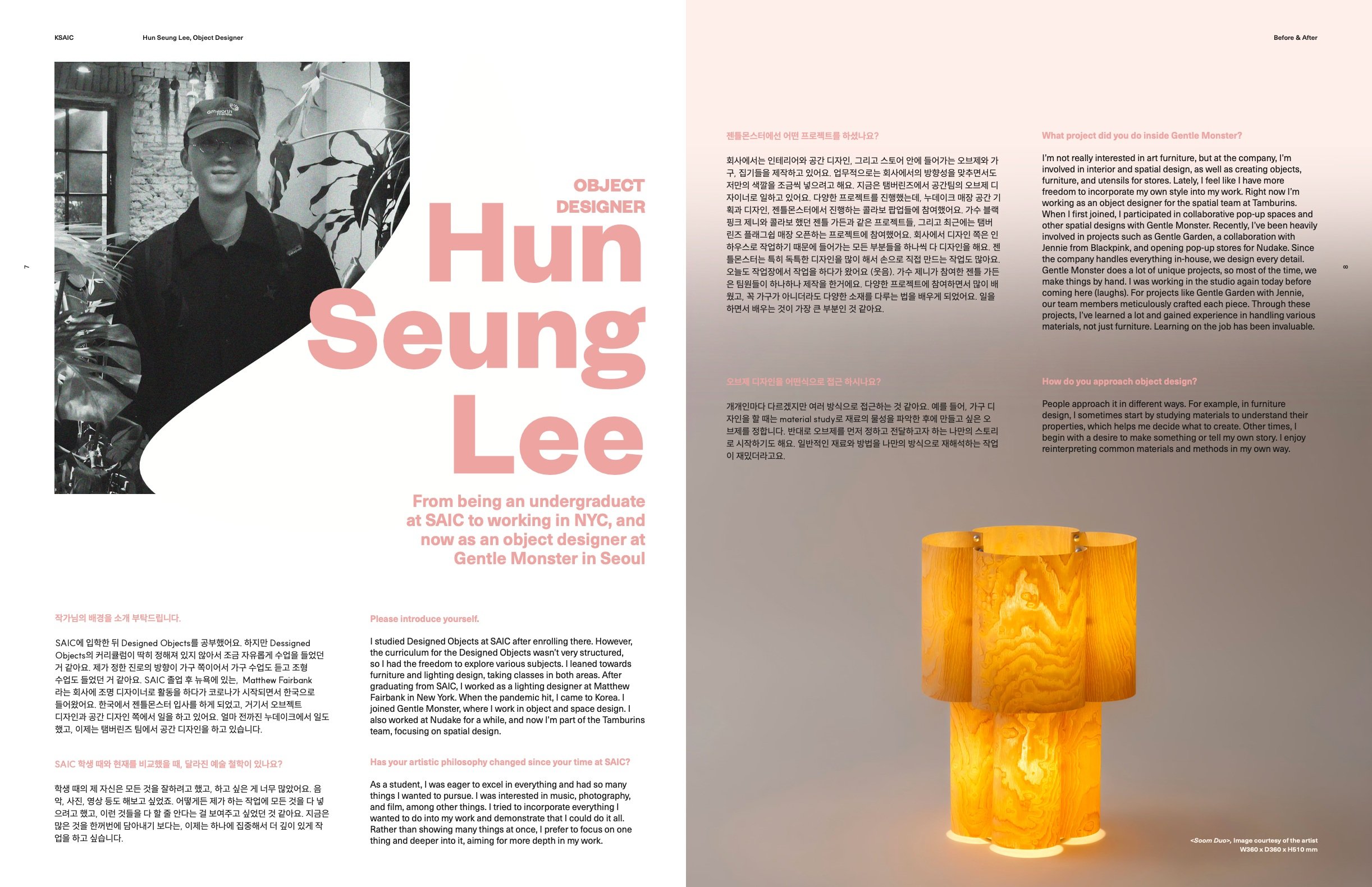
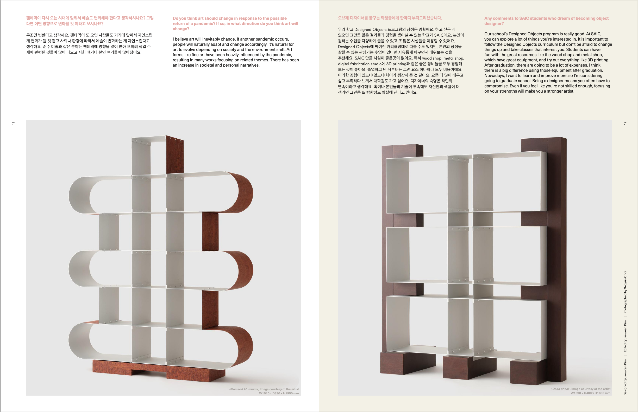
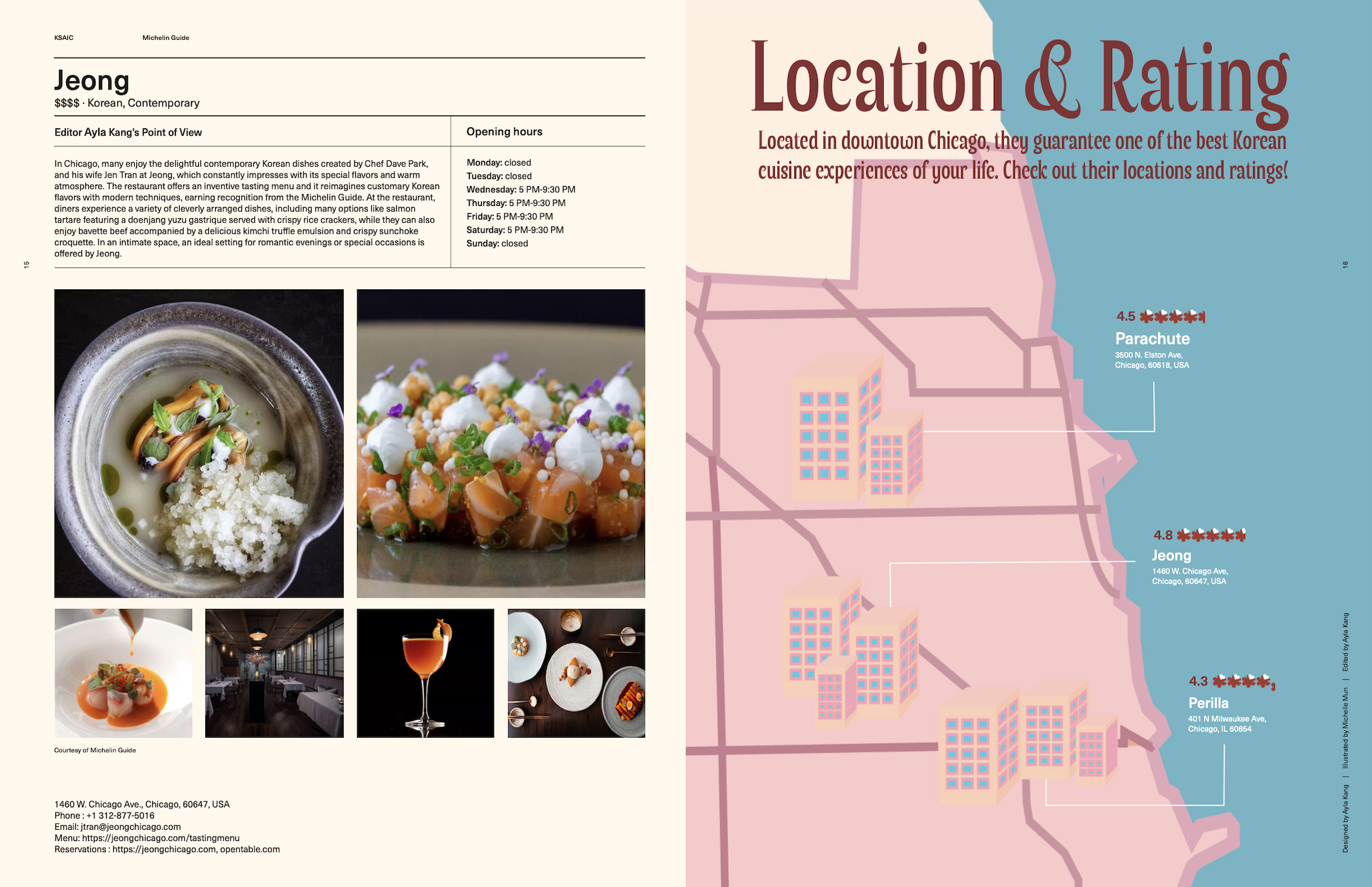
KSAIC Magazine
KSAIC Magazine is a student-led publication created by the Korean Student Association (KSA) publication team at the School of the Art Institute of Chicago. This magazine serves as a platform to highlight campus life, art exhibitions, student events, notable SAIC alumni, competitions, and cultural insights. It features in-depth interviews, editorial content, and visual narratives that engage the SAIC community.
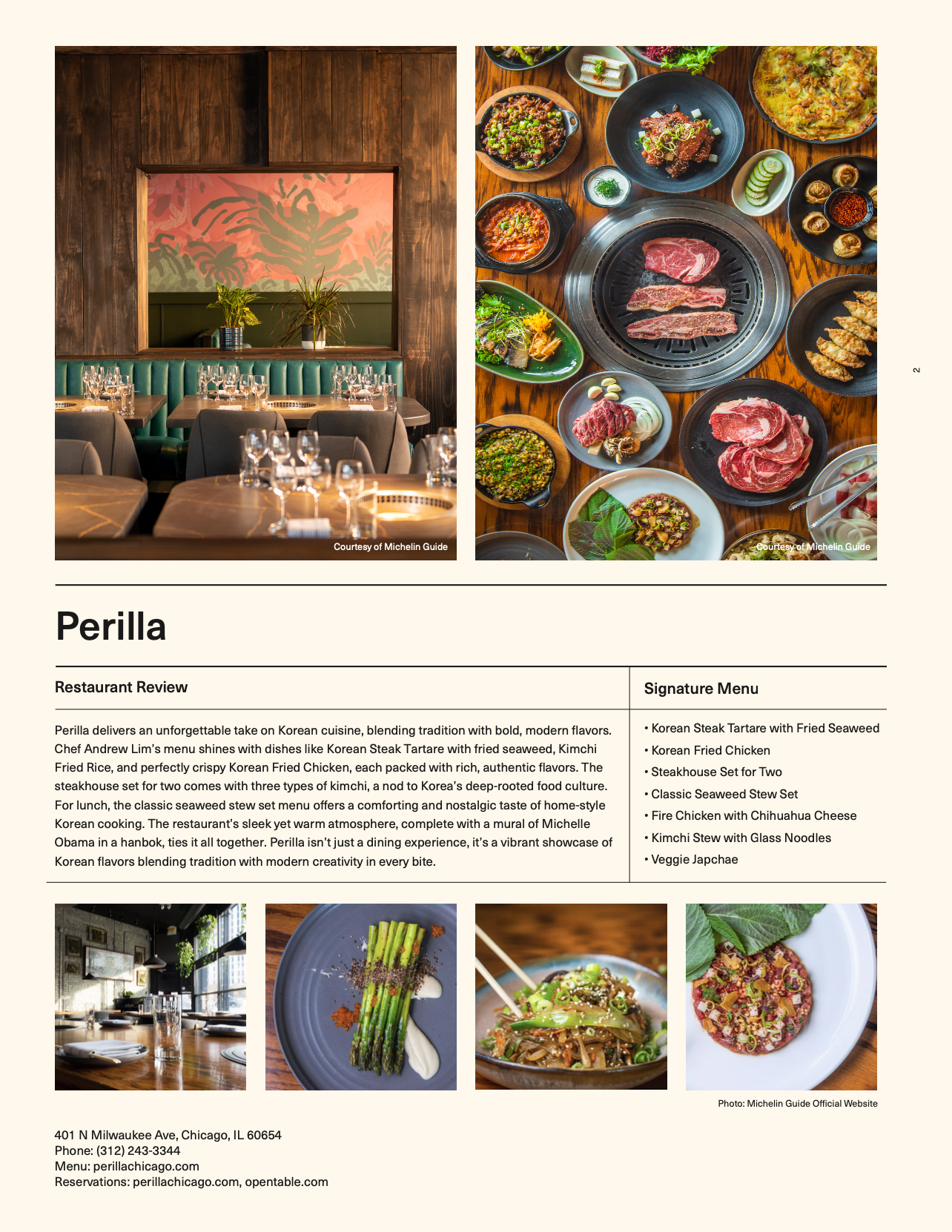
My personal contribution includes a four-page Michelin Guide spread, where I curated, designed, and assembled the content, showcasing recommended Korean restaurants in Chicago. The remaining sections of the magazine were collaboratively designed by each team member, with ongoing modifications and refinements made collectively. The final publication is featured on SAIC’s official website and distributed among students upon special request from the institute.


Original Narrative Book
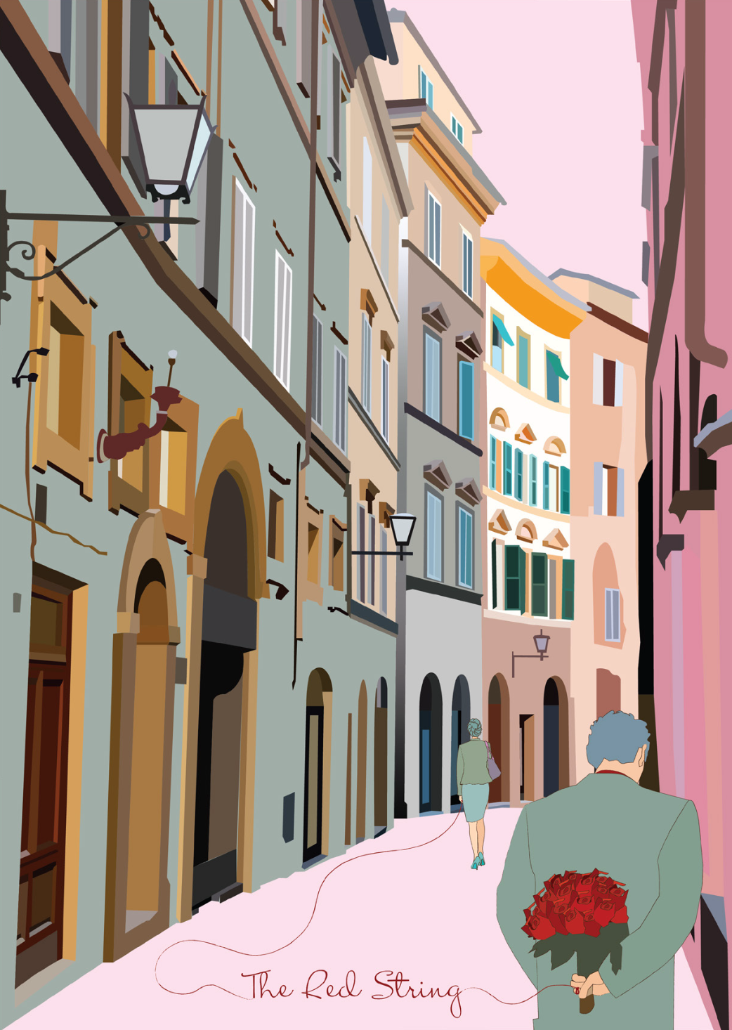
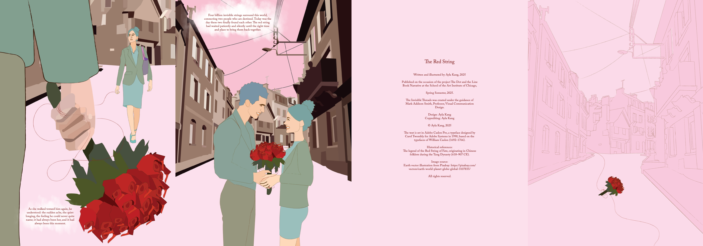
THE RED STRING | Accordion Book
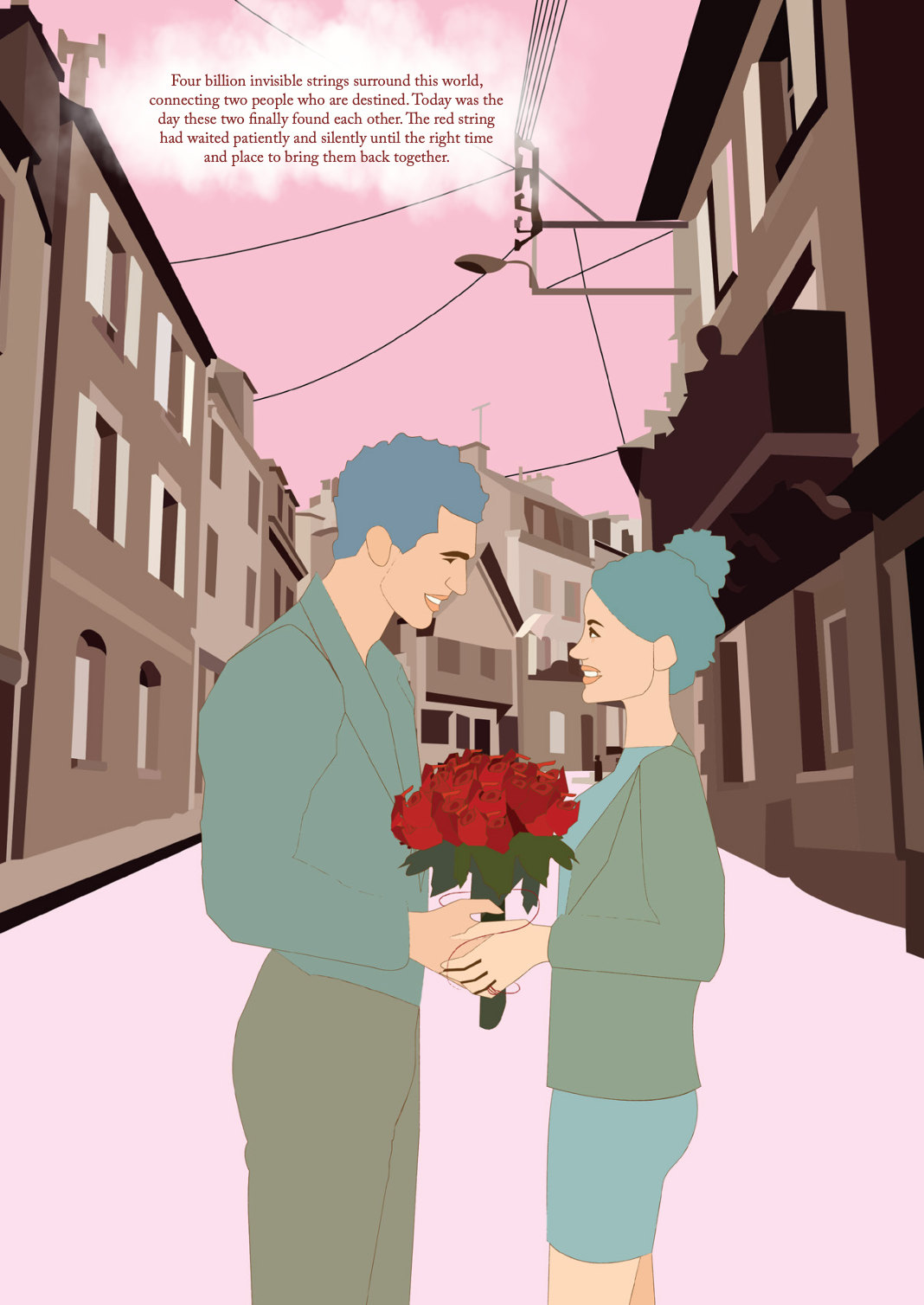
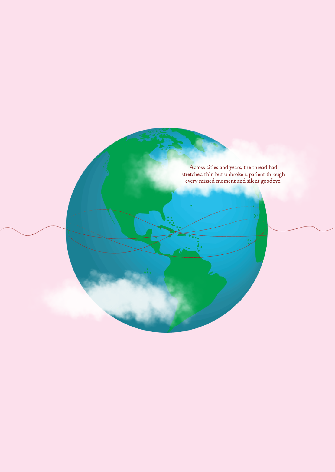
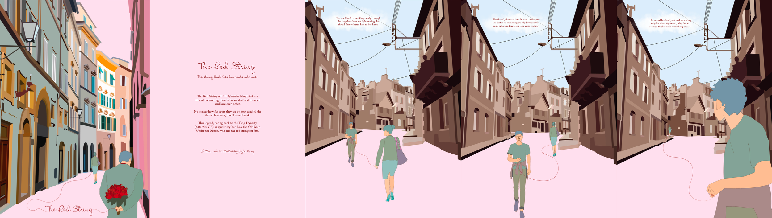
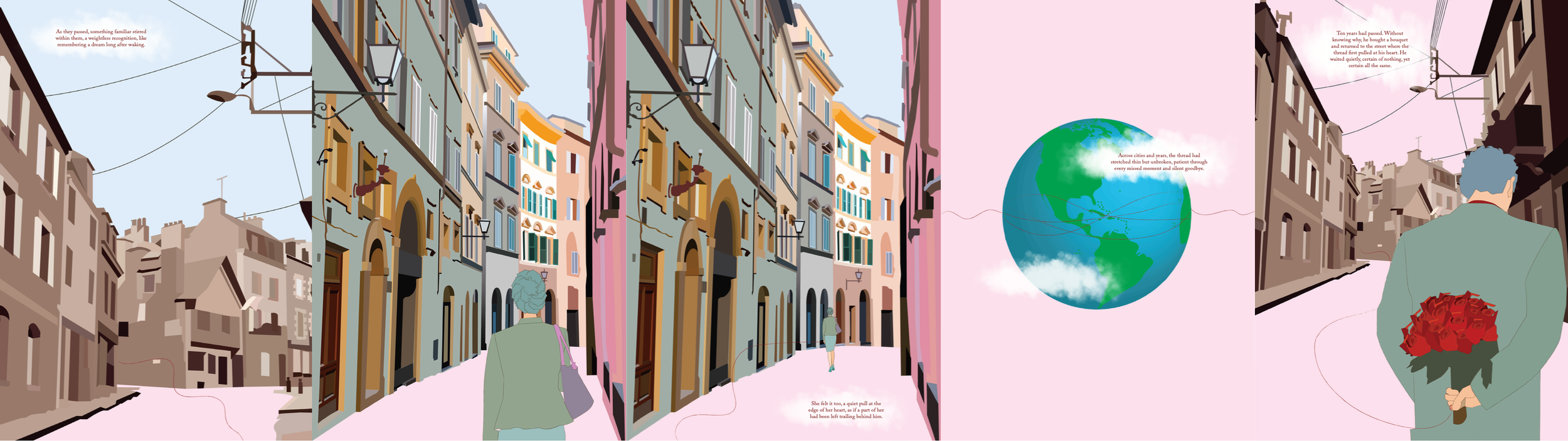
The Red String is an original story and book design, fully written, illustrated, and designed by me. Inspired by the ancient Chinese legend of the Red String of Fate (yīnyuán hóngxiàn), the narrative follows two souls destined to meet, connected by an invisible thread that stretches across time and distance.
Created entirely in Adobe Illustrator and Adobe InDesign, this project demonstrates my skills in storytelling, illustration, typography, and layout design. The book uses Adobe Caslon Pro to evoke a timeless and elegant aesthetic, while the minimalist illustrations emphasize themes of fate and human connection.


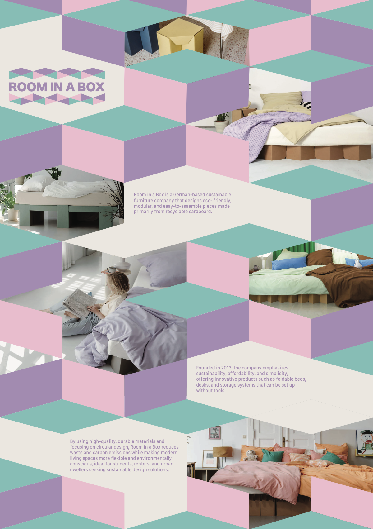
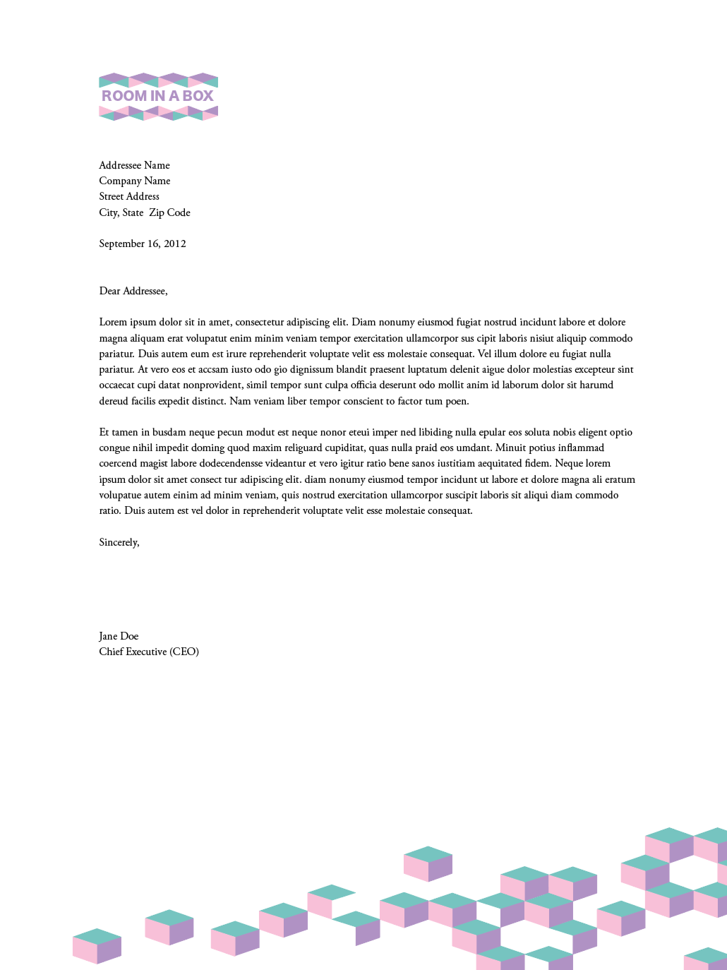
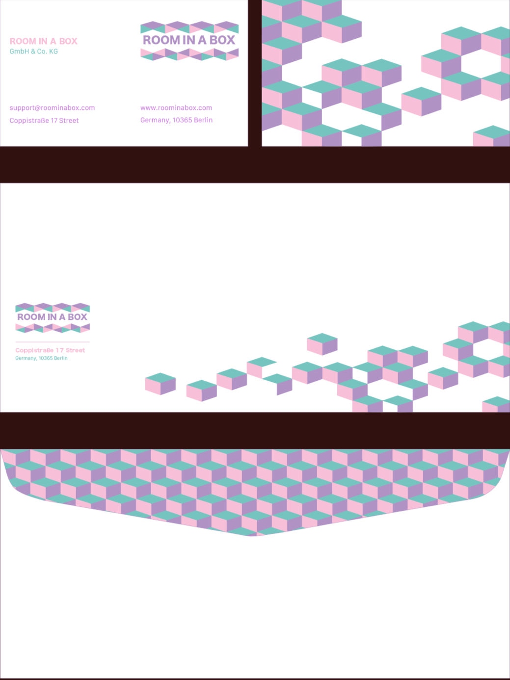
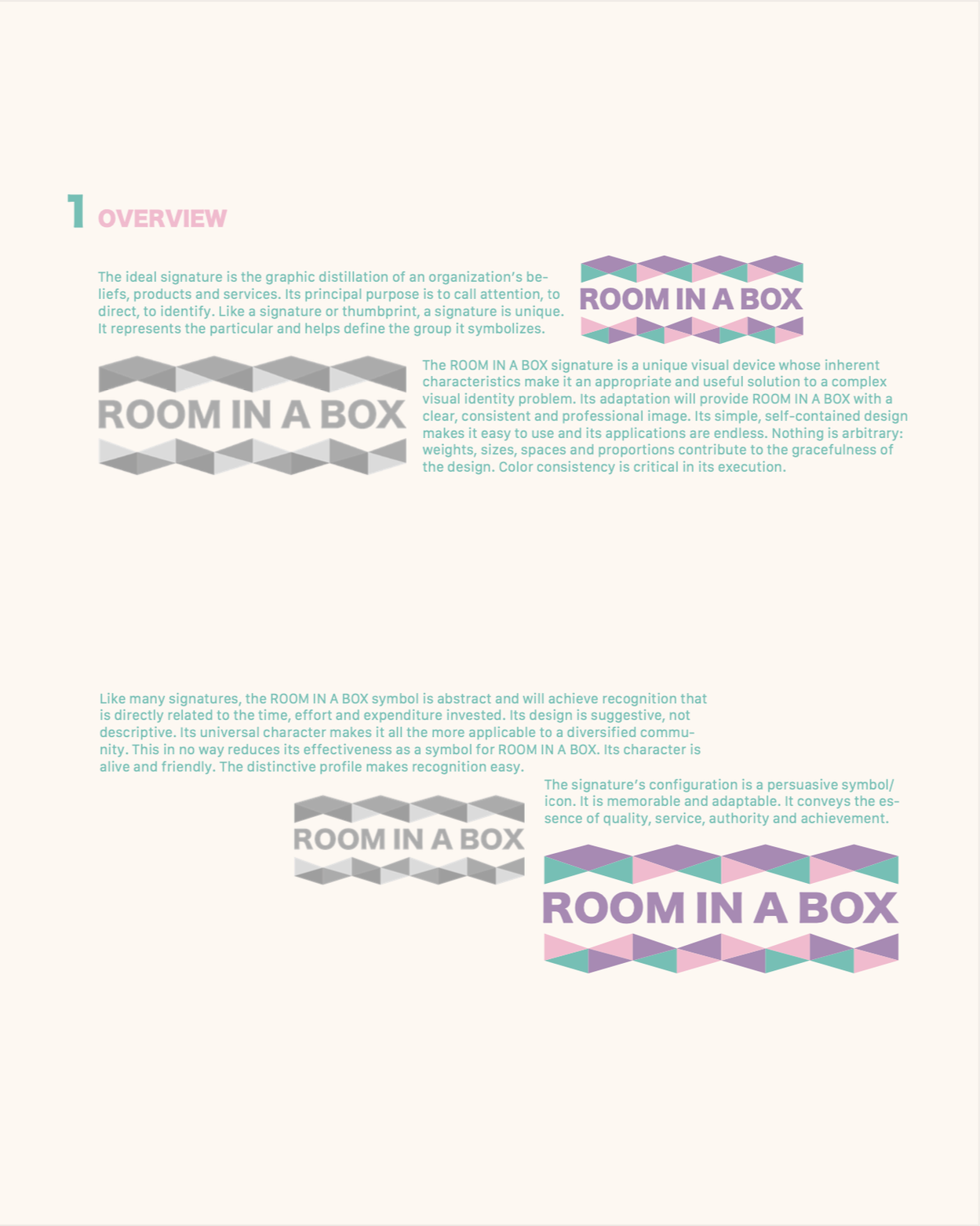
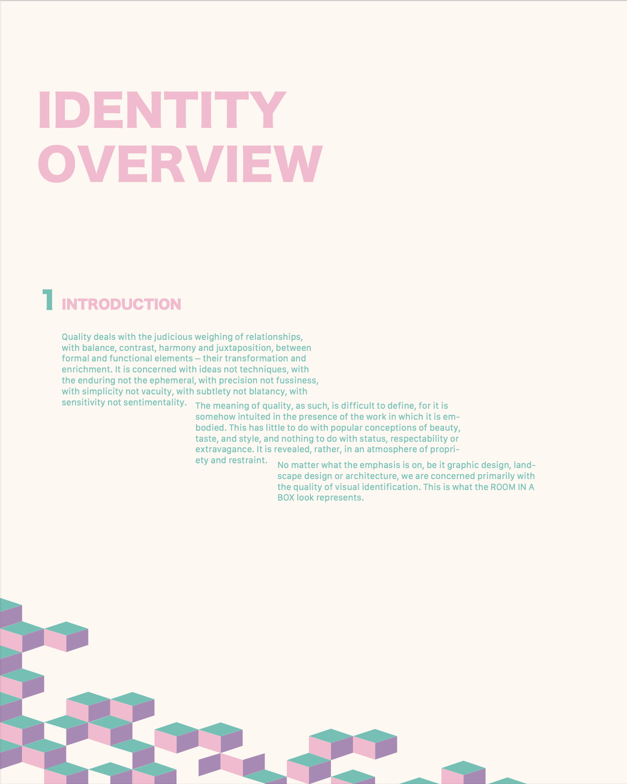
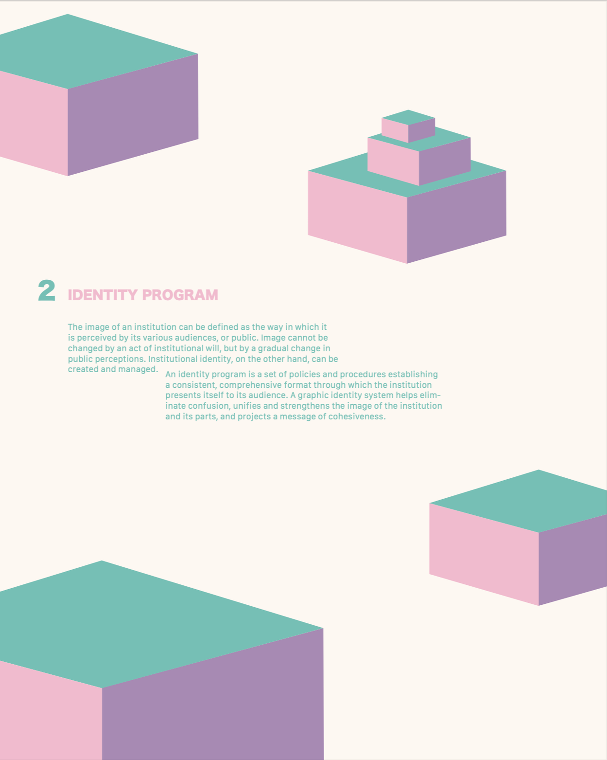
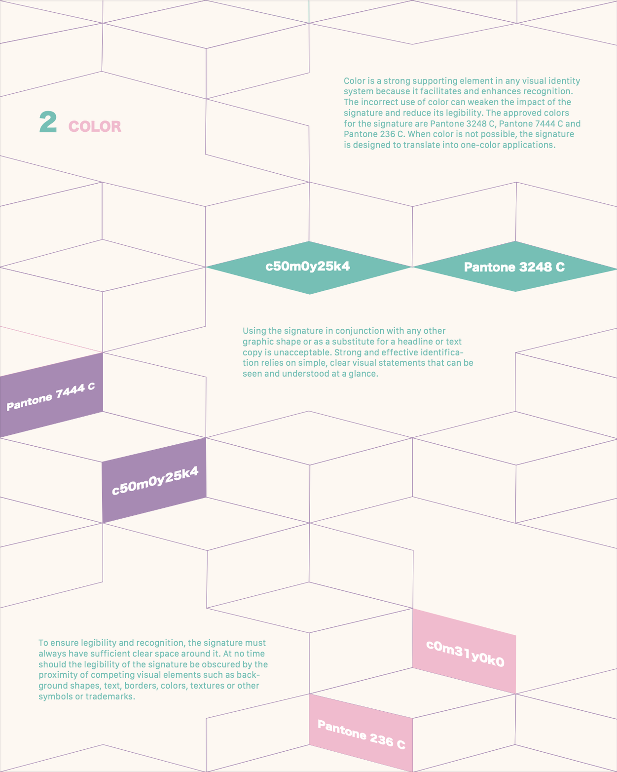
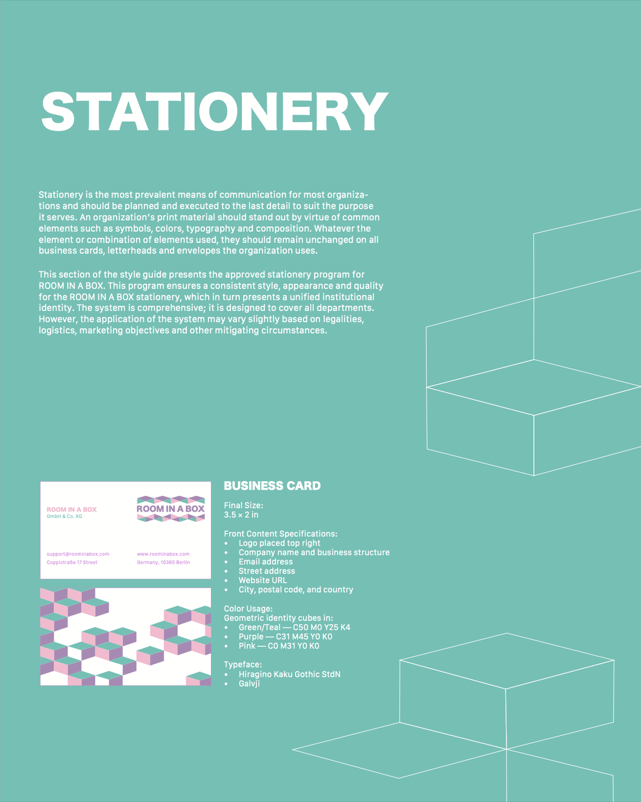
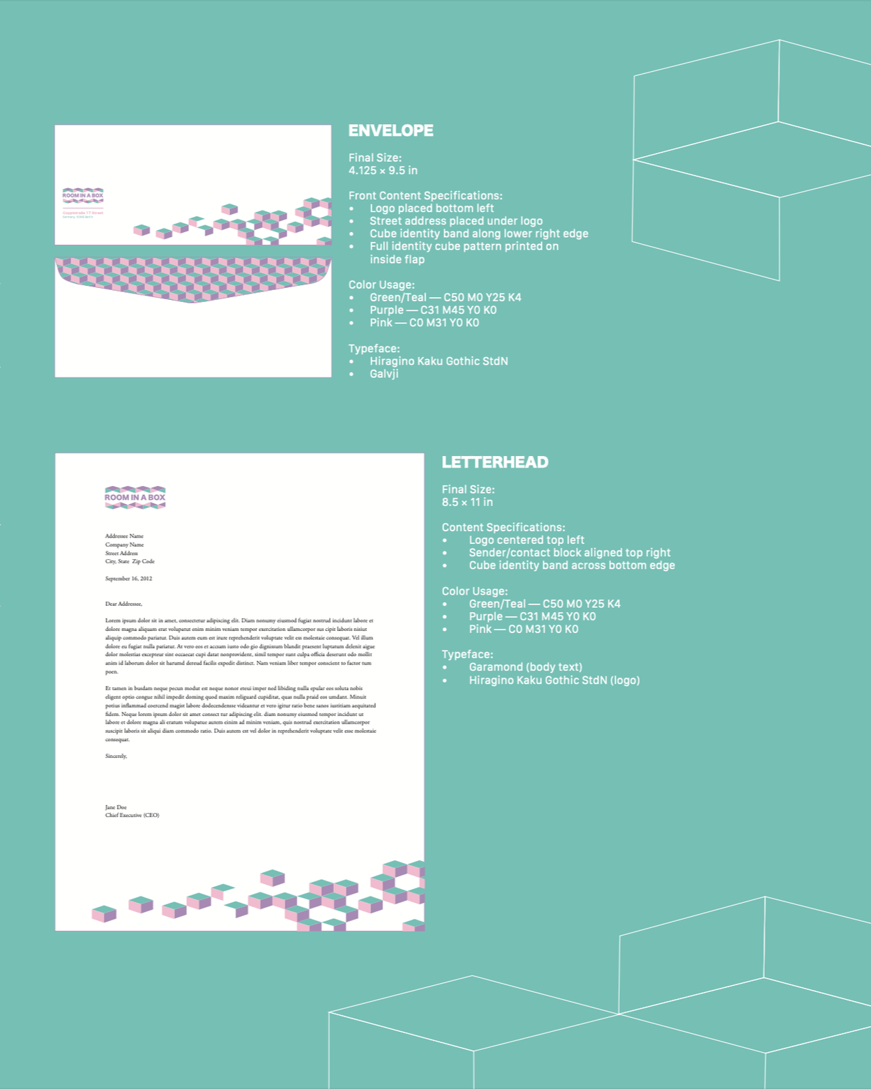
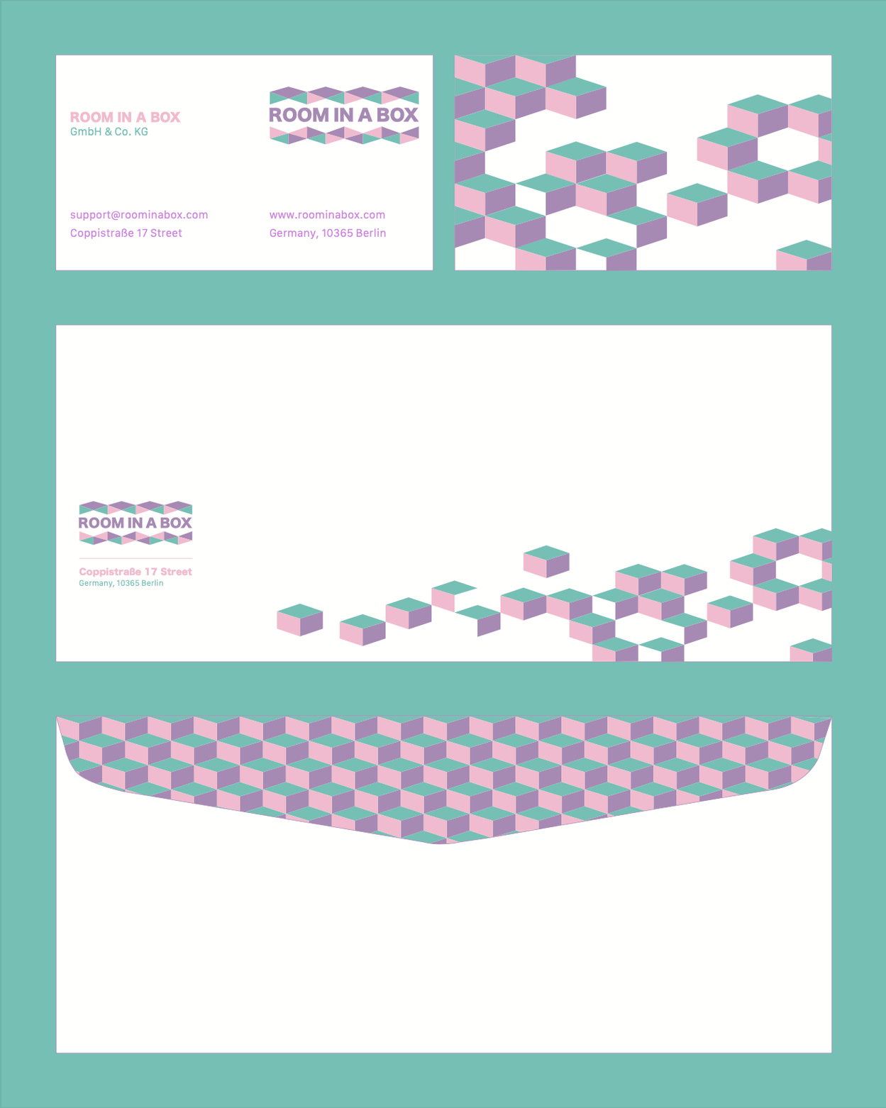
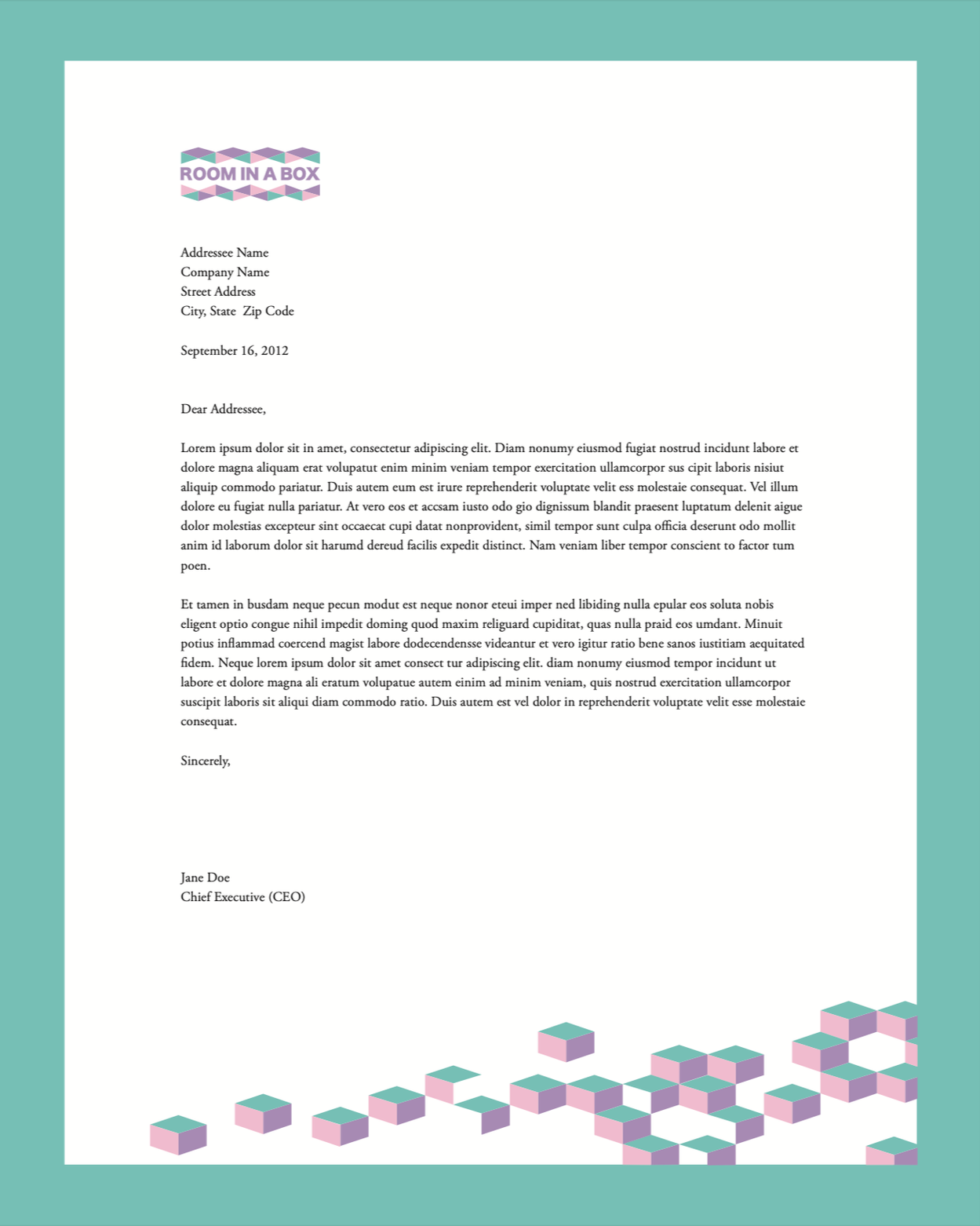
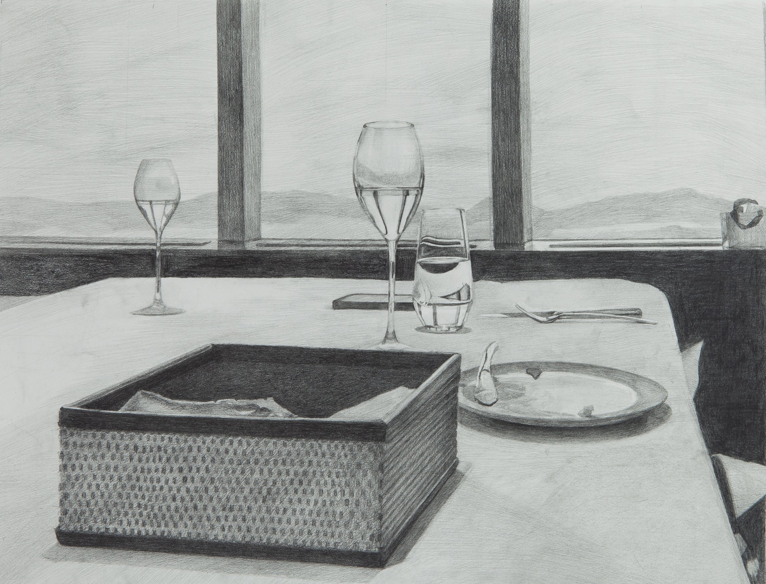
Room in a Box: Stationery & Brand Application
This stationery project was developed as part of a brand application study for Room in a Box, focusing on translating an existing brand identity into cohesive printed materials. The project explores how visual communication can extend beyond packaging into everyday touchpoints through editorial layout, typography, and material-driven design.
The stationery system includes business cards, letterheads, envelopes, and branded communication assets designed to maintain consistency with the brand’s minimalist and modular aesthetic. Emphasis was placed on hierarchy, spacing, and subtle typographic decisions to create a refined and functional visual language. The project reflects an exploration of how design systems can remain adaptable while maintaining clarity and cohesion across multiple formats.
Fujifilm Camera Illustration
This realistic illustration of a Fujifilm camera was created entirely in Adobe Illustrator. I focused on capturing intricate details such as the lens, dials, and metallic textures to achieve a three-dimensional, photorealistic effect.
This project demonstrates my skills in precision drawing, shading, and digital rendering, showcasing how Illustrator can be used to create lifelike objects purely through vector-based design.

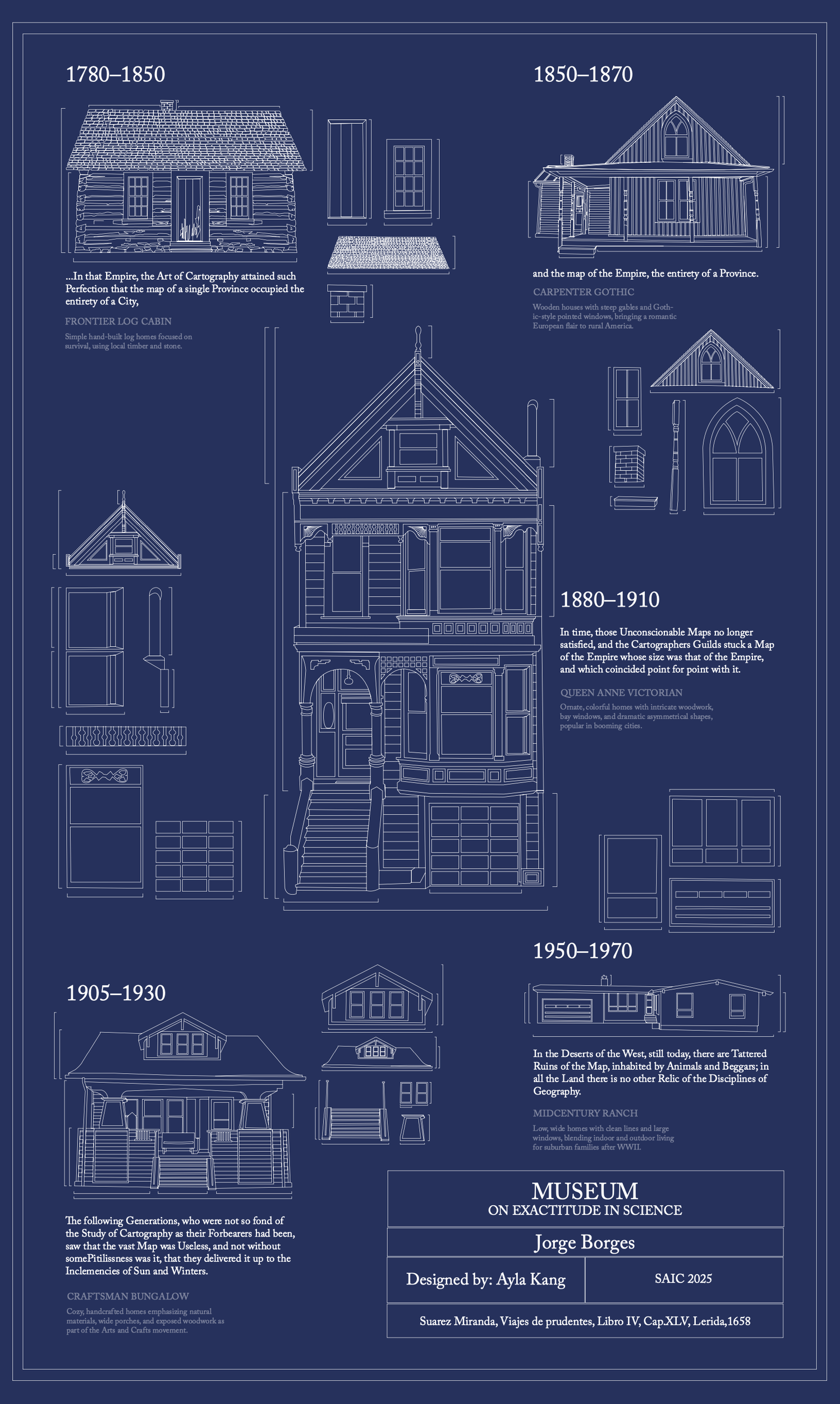
Museum: On Exactitude in Science
This project is a blueprint-style illustration inspired by Jorge Borges’ story “On Exactitude in Science.” It explores the evolution of American residential architecture, featuring detailed drawings of iconic house styles from 1780 to 1970, including Frontier Log Cabins, Carpenter Gothic homes, Queen Anne Victorians, Craftsman Bungalows, and Mid-Century Ranch houses.
Using Adobe Illustrator, I meticulously created technical line drawings to reflect the precision and clarity of architectural blueprints. The design visually communicates how architectural styles reflect the cultural and historical contexts of their time.
This project highlights my skills in information design, technical illustration, and storytelling through visual systems, blending architectural history with a conceptual narrative.
Nat King Cole
This poster was designed to promote a Nat King Cole performance at Blue Chicago on Clark. Using Adobe Illustrator, I combined bold typography with a surreal, urban-inspired illustration to capture the rhythm and energy of jazz music. The vertical alignment of the text mirrors the towering cityscape, while the limited color palette adds a modern, sophisticated feel.
The illustration featured on the poster is entirely original and created through a hands-on process. I first painted paper sheets using three colors—two adjacent on the color wheel and one contrasting color from the opposite side—to create visual harmony with a striking accent. I then cut the painted paper into abstract cityscape shapes, carefully arranged the pieces, and photographed them. Finally, I digitally transformed the composition into a cohesive illustration using Adobe Illustrator and Photoshop. This multi-step approach gave the poster a unique textured and handcrafted quality, blending traditional art techniques with modern digital design.
This project highlights my skills in typographic hierarchy, composition, visual storytelling, and mixed-media design.

One Roof at a Time
Created to raise awareness about the benefits of green roofs, this poster combines physical 3D modeling and graphic design. The title “ROOF” emerges from a cityscape of concrete blocks, with vibrant greenery symbolizing sustainability and growth. This project integrates environmental advocacy and design, encouraging communities to transform urban spaces by “turning concrete into canopy.” A QR code links viewers to additional educational resources, connecting physical design with interactive learning.

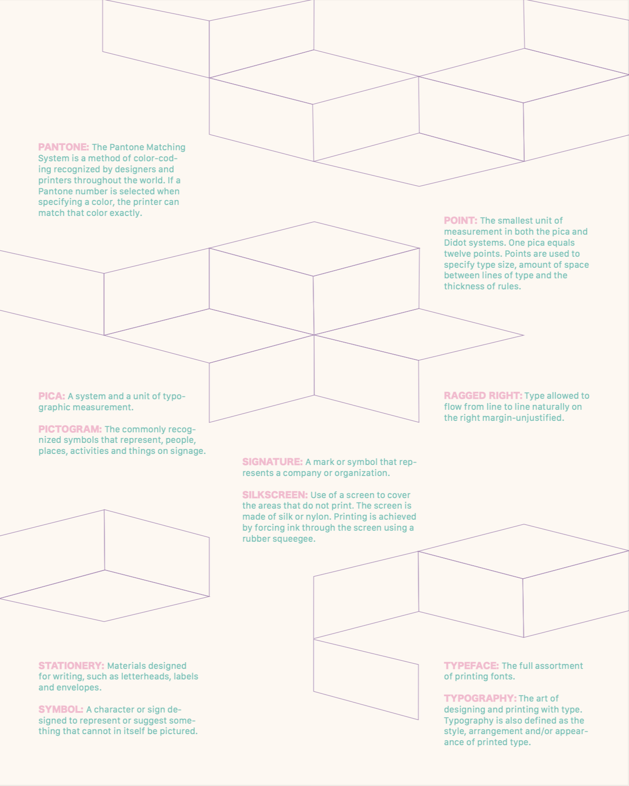
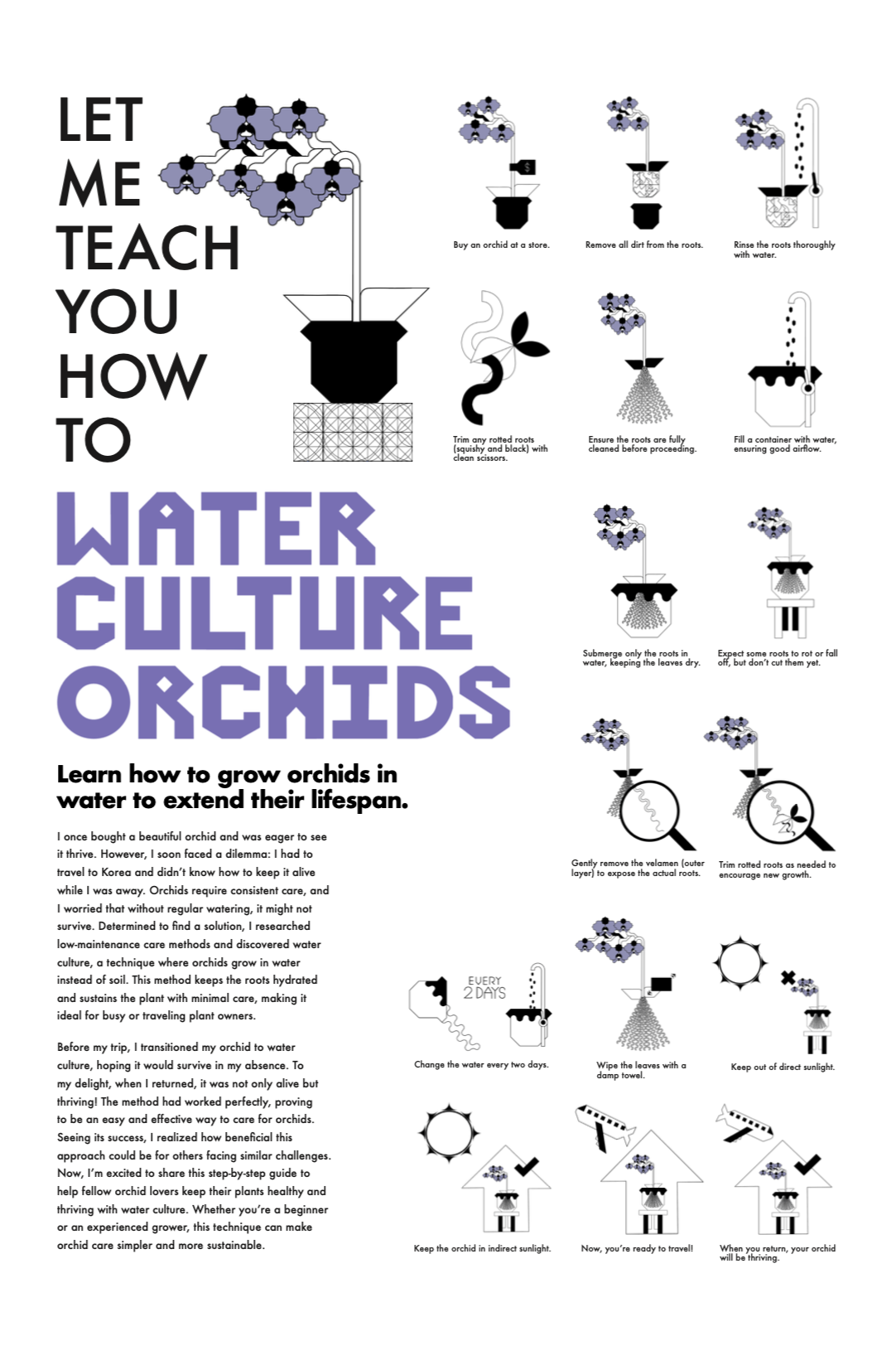
How To Water Culture Orchids
This instructional poster provides a clear, visual guide for growing orchids in water culture, a low-maintenance alternative to traditional soil planting. Using custom illustrations and a clean layout, I explained each step of the process, making the information accessible to both beginners and experienced plant enthusiasts. The design balances functionality and aesthetics, demonstrating my ability to communicate complex processes through visual hierarchy and iconography.
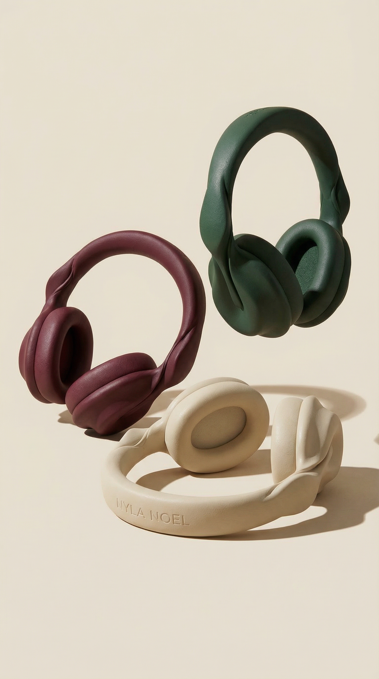
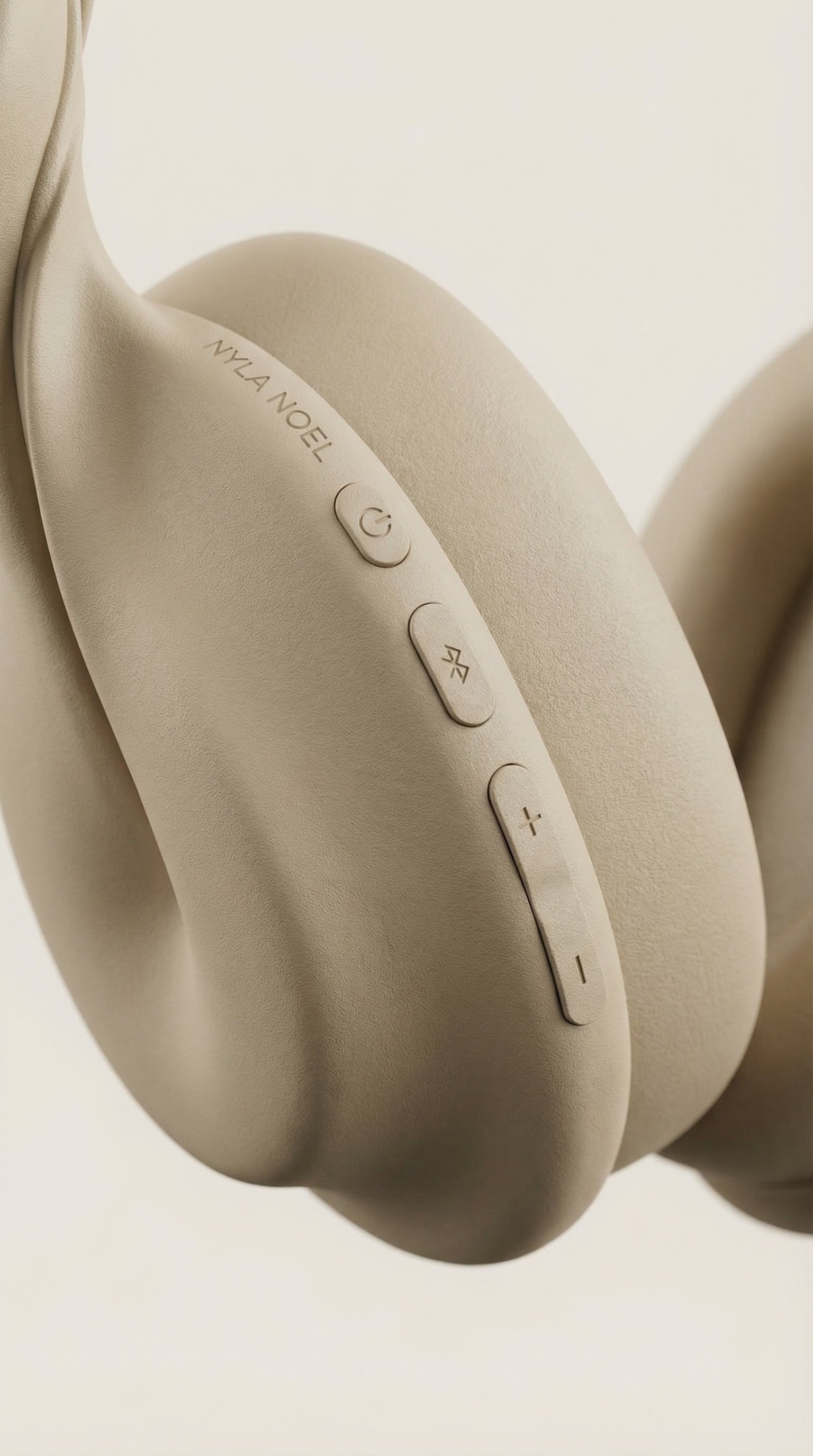
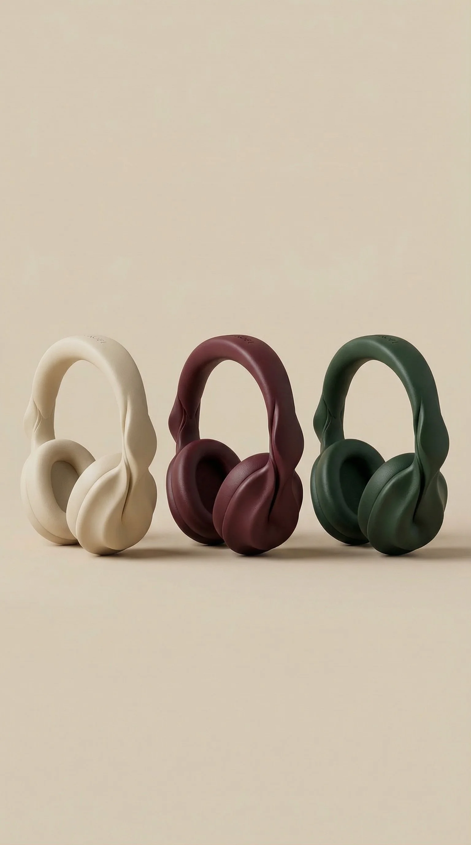
Nyla Noel: AI Exploration
This AI-generated visual was developed as part of an exploratory project to better understand emerging tools and workflows within contemporary design practice. While my core approach to art and design remains grounded in personal authorship, material experimentation, and the development of my own visual language, I recognize the growing presence of AI within an evolving creative landscape. The fictional brand Nyla Noel was created as a conceptual exercise, where I designed a series of sculptural headphone forms through AI-assisted image generation.
Film Production
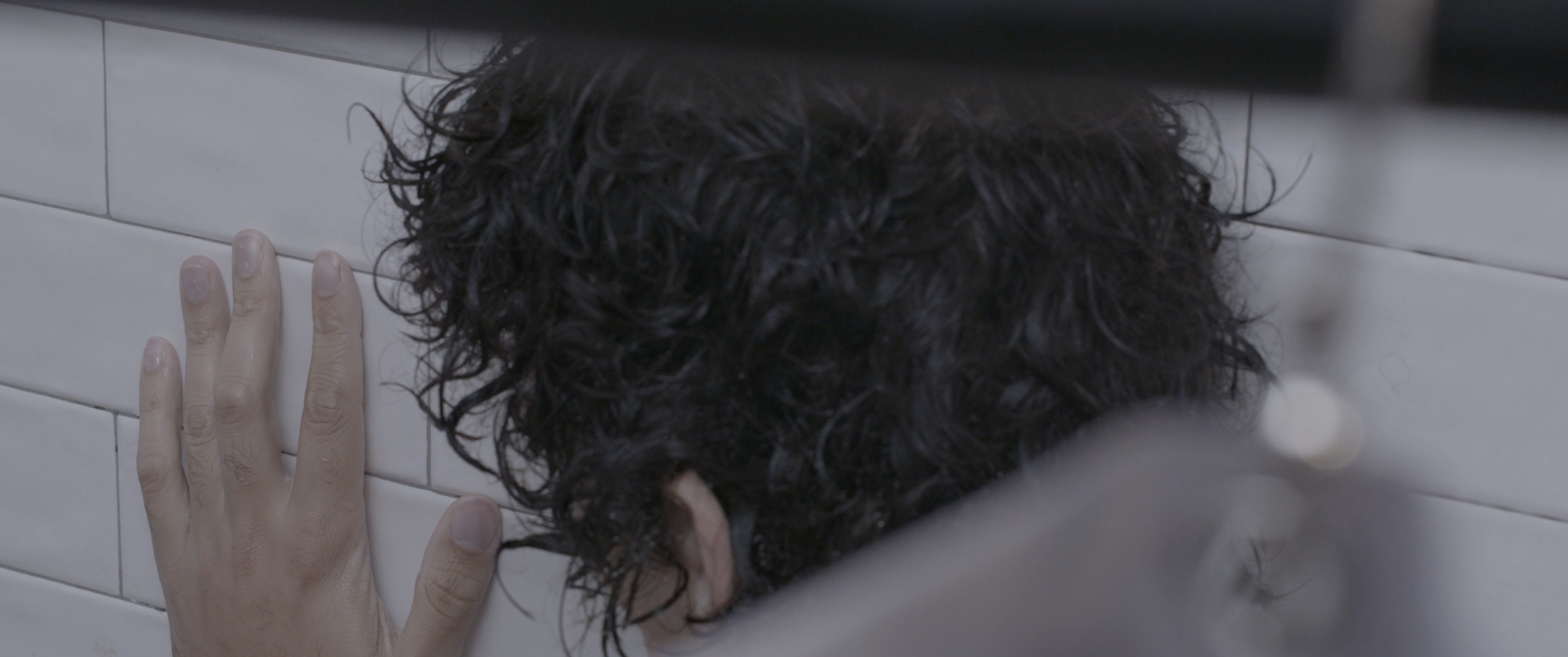
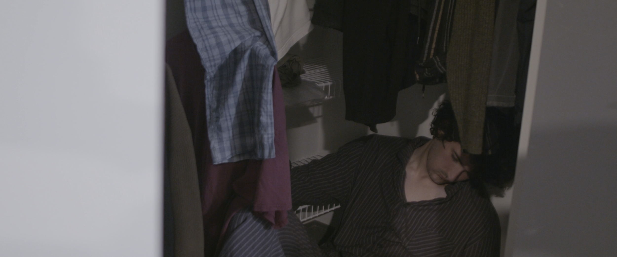
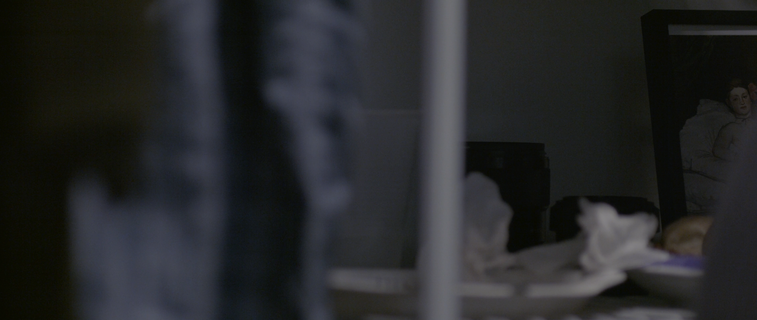
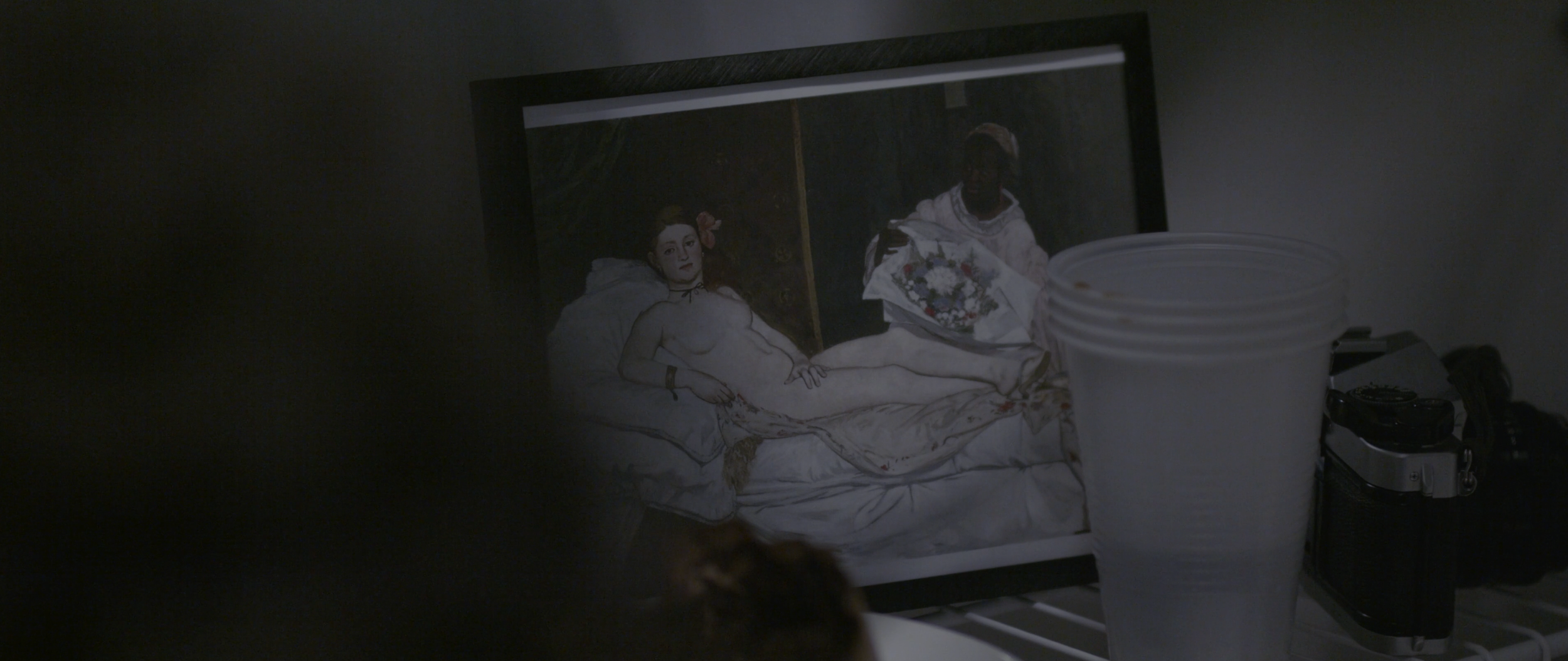
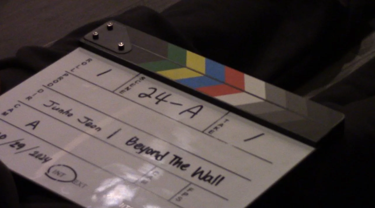
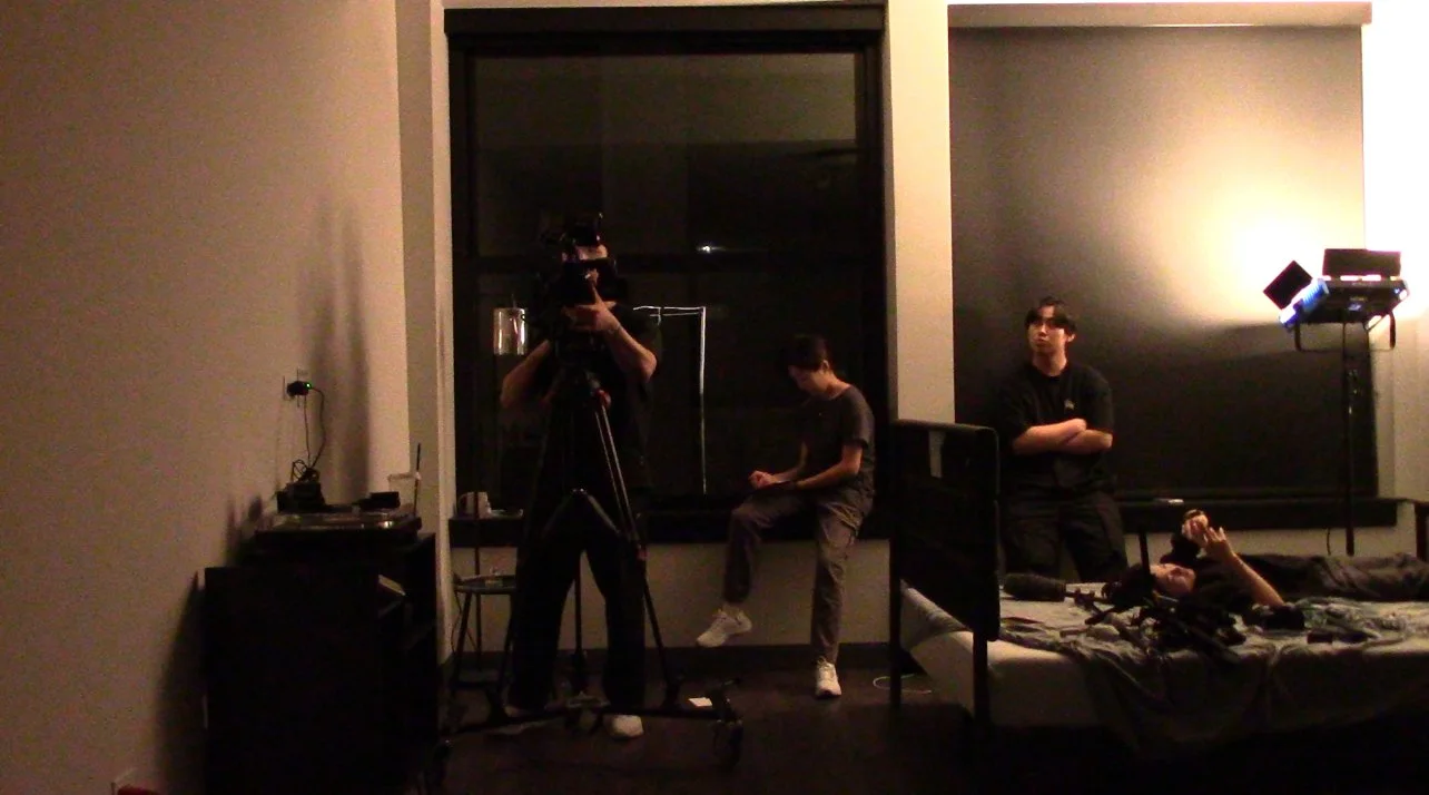
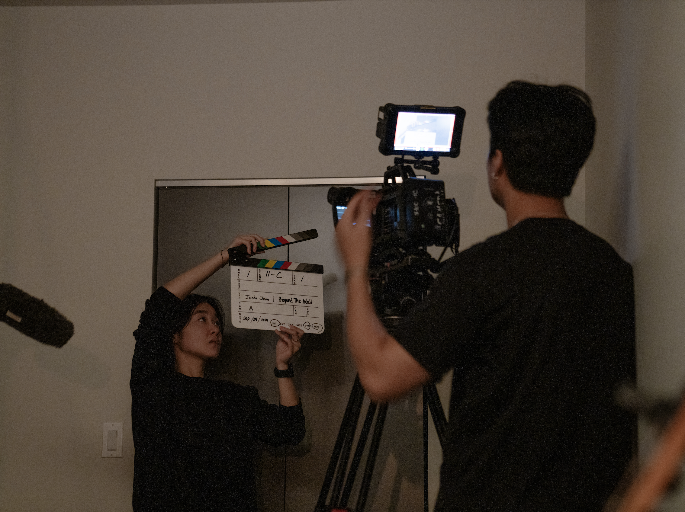
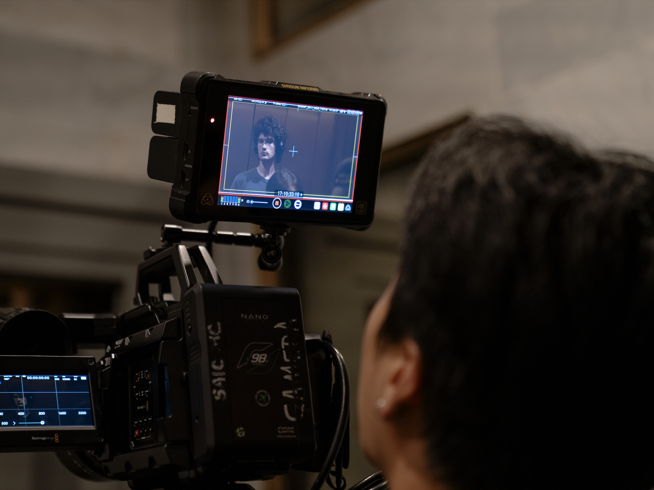
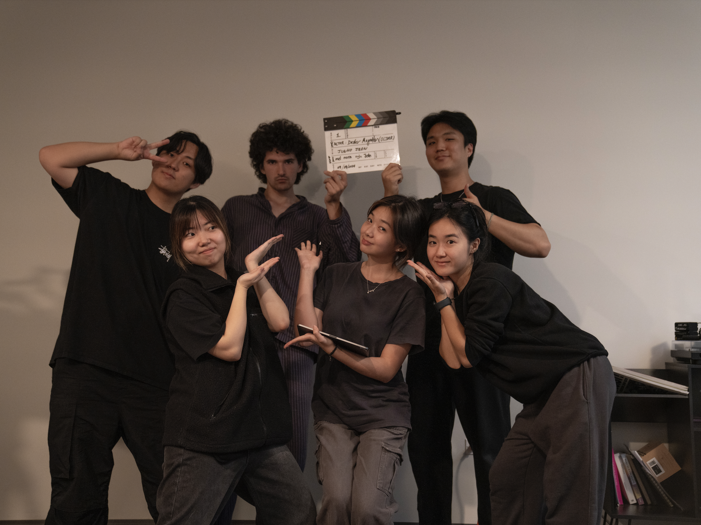
Art Director & Script Supervisor
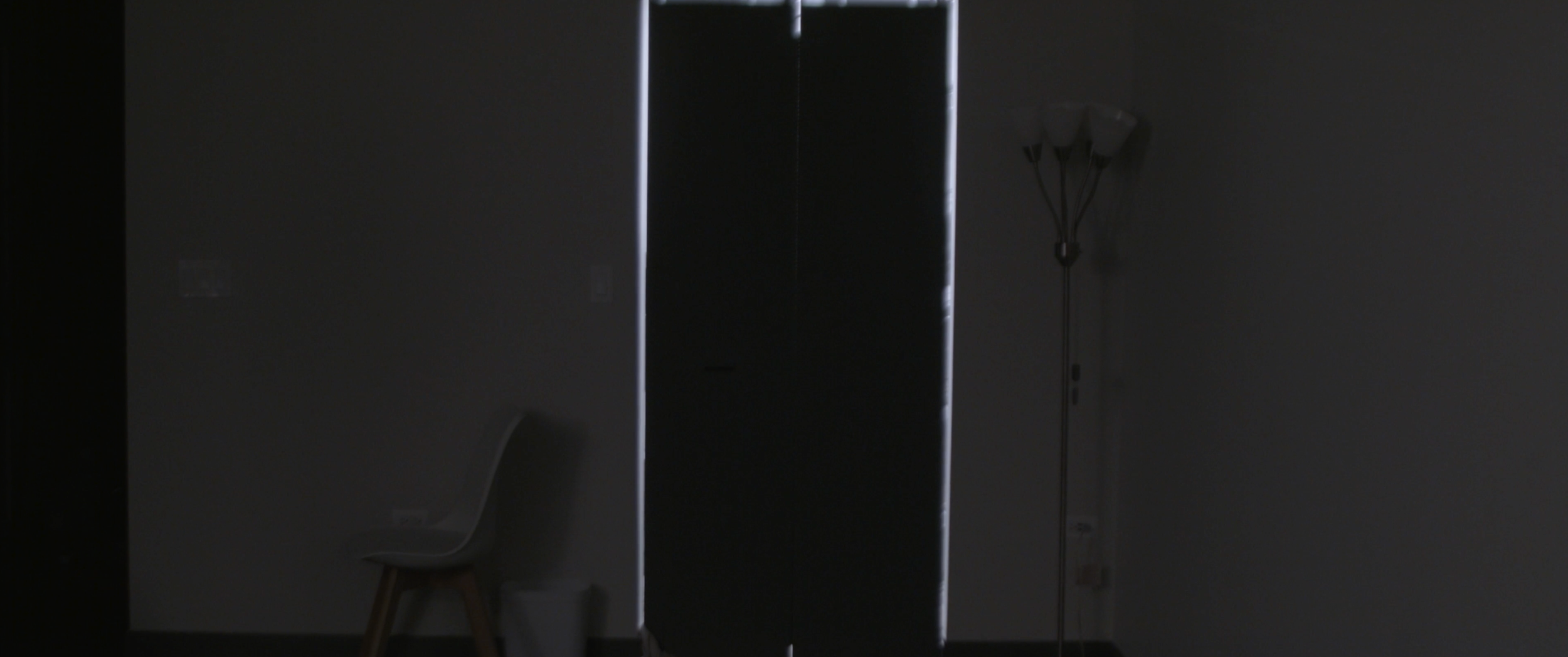
The Wall
"Individualism is increasingly prevalent in modern society, yet paradoxically, it explores the human instinct to obsess over others' lives and reveals voyeuristic desires."
My Role as the Art Director & Script Supervisor
I led the visual design and artistic direction of this film, ensuring a cohesive aesthetic that aligned with the director’s vision. I managed scene continuity by tracking shot details, coordinating props and actors, and maintaining seamless transitions. My work enhanced the film’s visual impact, resulting in a polished final product that stayed true to its storytelling goals.


Awards
GSB & S|C|S|C, Best Film Award
Korea International Short Film Festival (2025)
Berlin Lift-Off Film Festival Season Award (2025)
Official Selection – Busan International Film Festival (2025)
Official Selection – Tokyo Lift-Off Film Festival (2025)

Painting & Drawing


Bone of My Bone
Acrylic Paint, Pink Foam Board | 725mm × 605mm
In my piece Bone of My Bone, I portray Adam and Eve, drawing inspiration from Genesis 2:22: “Then the LORD God made a woman from the rib He had taken out of the man, and He brought her to the man.” This passage reflects the intimate and intentional design of woman, formed from man’s side to stand beside him, cherished and valued.
Throughout Scripture, woman is depicted as a reflection of beauty, strength, and purpose. Eve was not created from Adam’s feet to be beneath him, nor from his head to rule over him, but from his side, symbolizing partnership, unity, and love (Ephesians 5:25-28). The responses to my work were diverse. Some saw it as a testament to man’s significance, while others viewed it as a reminder that man was made incomplete without woman. This contrast is compelling because it reveals how perspective shapes interpretation, drawing attention to the depth and complexity of this biblical moment.
This painting ultimately celebrates woman’s creation as divinely ordained and uniquely fashioned as part of God’s perfect design, revealing the harmony and completeness of man and woman together.

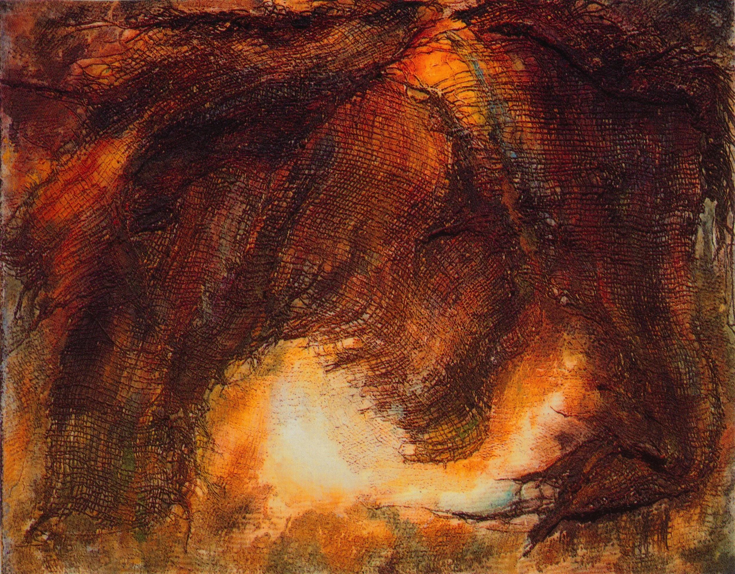
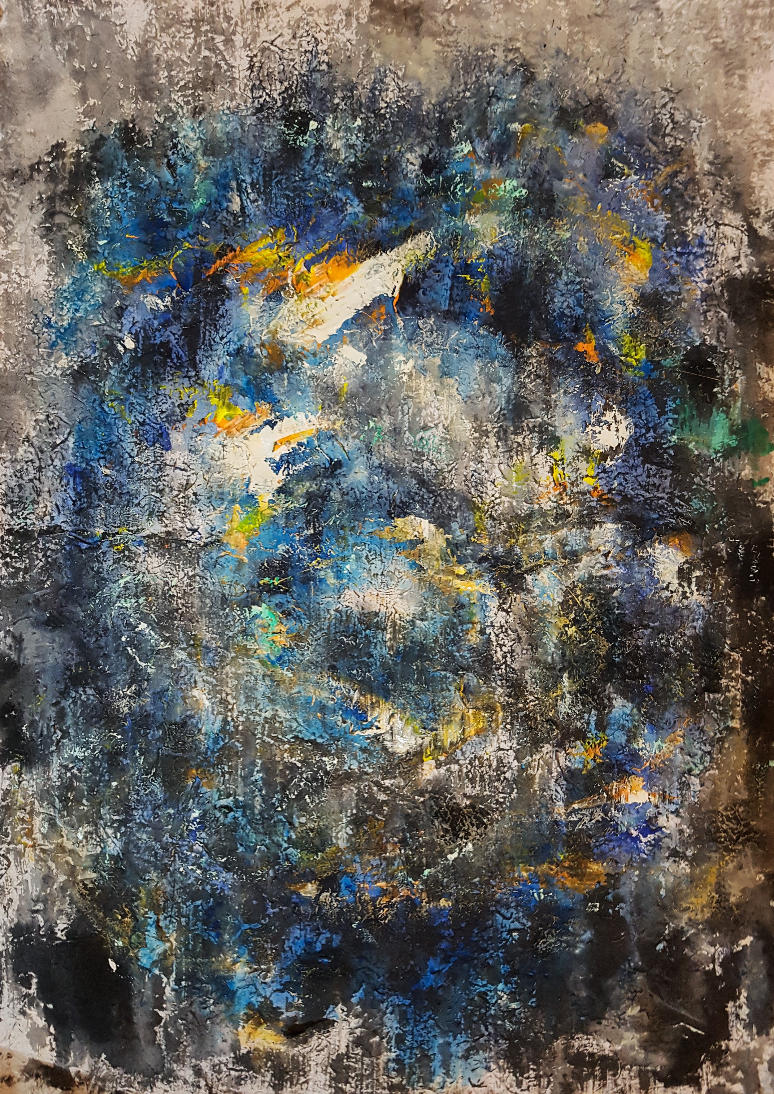
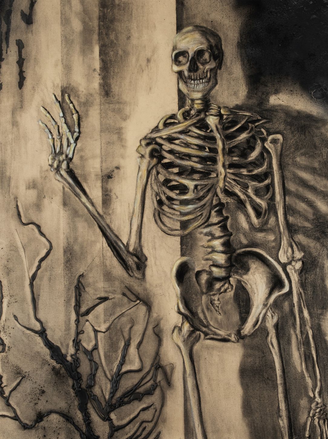
Repetition
Charcoal, Glue Gun, Fire, Spray Paint | 880mm × 1150mm
This piece explores the endless cycle of desire and temptation, where history repeats itself, and lessons remain unlearned. The skeletal figure, frozen in time, reaches for something just beyond its grasp—an echo of past mistakes, a longing for something already lost. Though stripped of life, it still lingers in the motion of reaching, a reminder that even in absence, the pull of temptation endures.
The interplay of light and shadow breathes movement into the bones, while the textured background evokes a sense of decay and inevitability. The contrast between presence and emptiness, past and present, suggests a haunting question: Are we ever free from our own repetition, or are we fated to reach for the same illusions, time and time again?

Dual Perspectives
Acrylic Paint, Digital photoshop, Black ink, Black Pen, White Pen, Water Color | 380mm × 510mm
This mixed-media piece explores the different experiences and perspectives shaped by society, despite individuals being part of the same country. The two faces share a connection yet exist within distinct backgrounds, symbolizing how opportunities and experiences can vary based on social and historical influences.
A key visual element is the contrast in patterns—intricate designs on one side represent opportunities and experiences, while the other side has fewer patterns, symbolizing different challenges and perspectives. The gradual transition of patterns reflects how access to opportunities is often shaped by complex societal structures.
Through the interplay of hand-drawn patterns, paint, and digital media, this piece conveys the nuances of individual experiences, emphasizing the ways in which history, culture, and perception influence personal and collective identity.

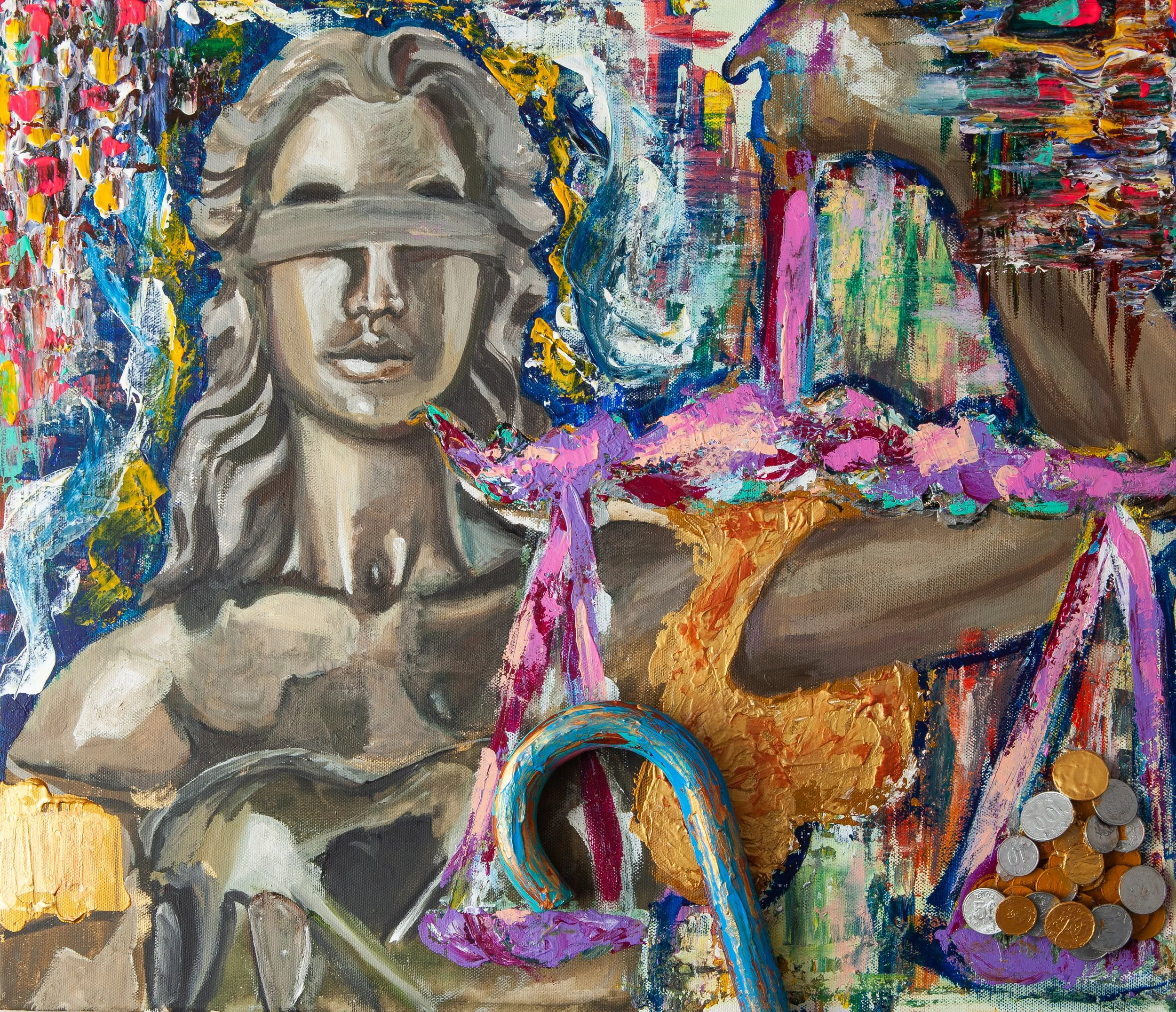
Blind Bargain
Walking Stick, Coins, Acrylic Paint, Oil Paint | 540mm × 450mm
This piece reimagines Themis, the Greek Goddess of Justice, whose blindfold symbolizes impartiality and fairness under the law. Traditionally, her scale weighs truth and punishment without bias, yet here, the balance is visibly manipulated, exposing the irony of justice influenced by power and deception.
On the right side, coins weigh heavily on the scale, representing the influence of wealth and authority. The person tilting the scale on the left remains unseen, hidden behind the illusion of fairness. As power grows, so does the web of deception—one manipulation leading to another, until the weight of corruption becomes too great to reset.
Through expressive textures, bold strokes, and mixed media elements, this painting critiques the fragility of justice, questioning whether true fairness can exist in a world where power dictates the scales.
Sculpture & Ceramic


God’s View
Foam Board, LED Lights, Clay, Wires, Resin | 620mm × 910mm × 1310mm
This sculptural installation draws inspiration from the movement of ants, reflecting the relentless pursuit of power and wealth in human society. The composition portrays swarms of ants—symbolizing individuals and groups—competing for dominance as they converge toward a glowing central mass filled with money. The two distinct colors represent societal divisions, yet both follow the same path, illustrating how ambition and desire override hesitation or doubt.
The fragmented, layered structure enhances the sense of chaos and urgency, while LED lights illuminate the wealth at the core, emphasizing the irresistible pull of material gain. Through a combination of scale, texture, and lighting, this piece offers a thought-provoking perspective on the instincts that govern both human and animal behavior.
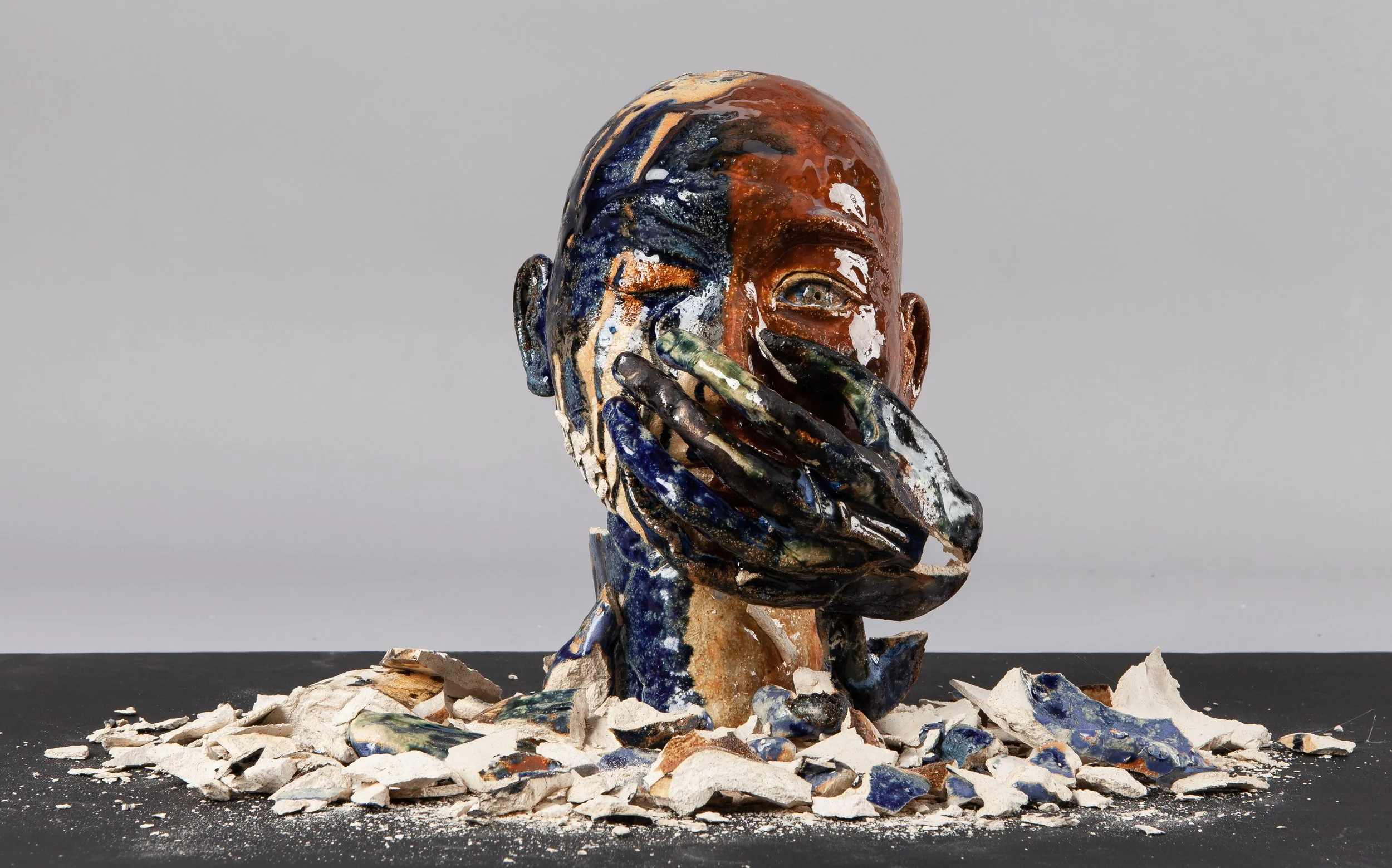
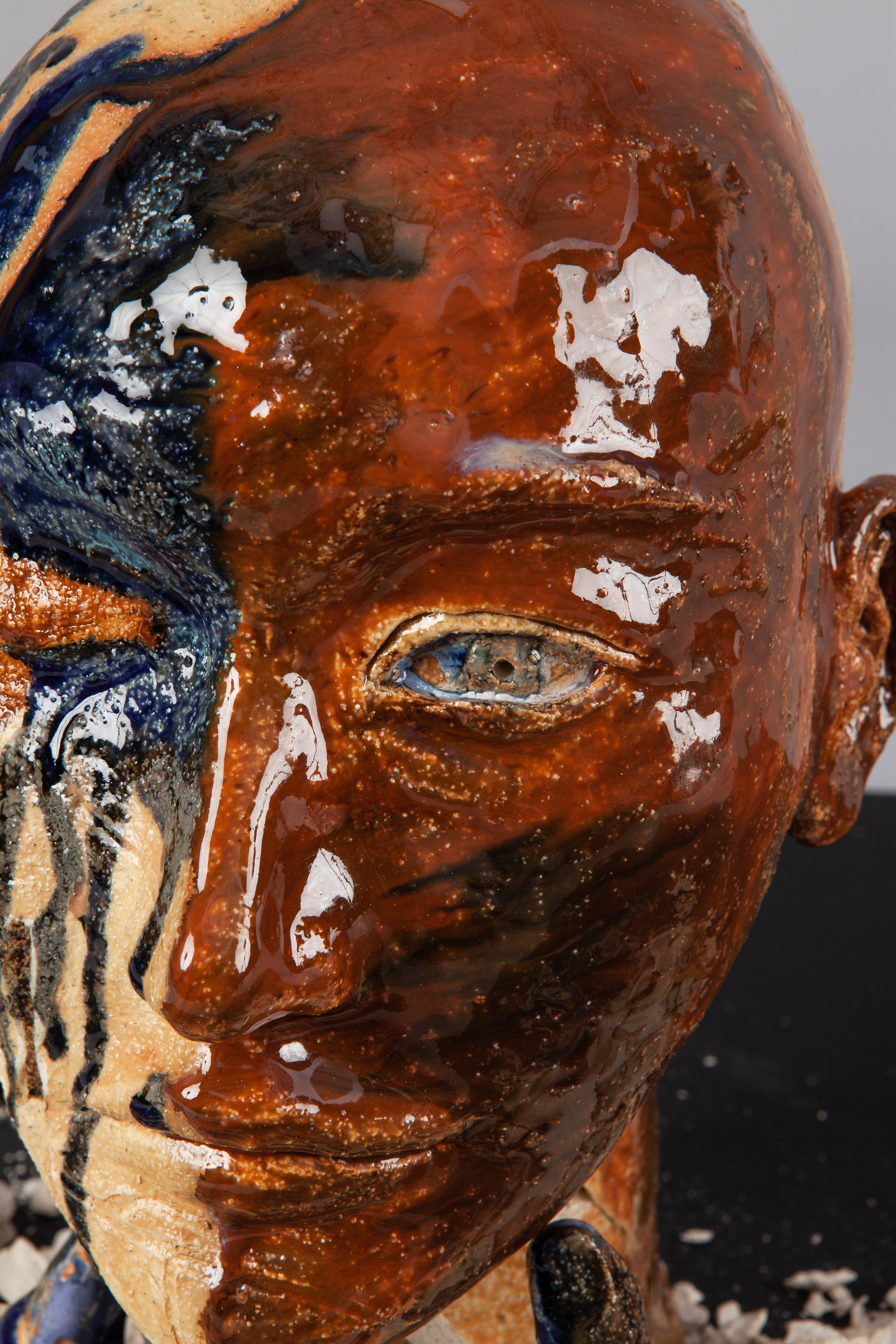
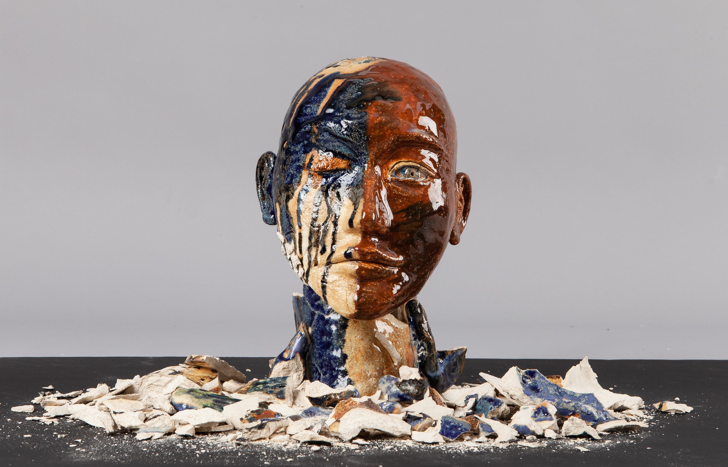
Silenced Fragments
Ceramic, Glaze | 180mm × 300mm
This ceramic sculpture explores the duality of human expression and the tension between outward perception and internal reality. The left side, marked by a tear, symbolizes suppressed emotion, while the right side, with a hand covering the mouth, represents unspoken thoughts and restraint. The shattered ceramic pieces at the base embody hidden truths and emotions that lie beneath the surface, revealing the fragile nature of identity and self-expression. Through contrast, texture, and fragmentation, this piece reflects the delicate balance between what is seen and what remains concealed.
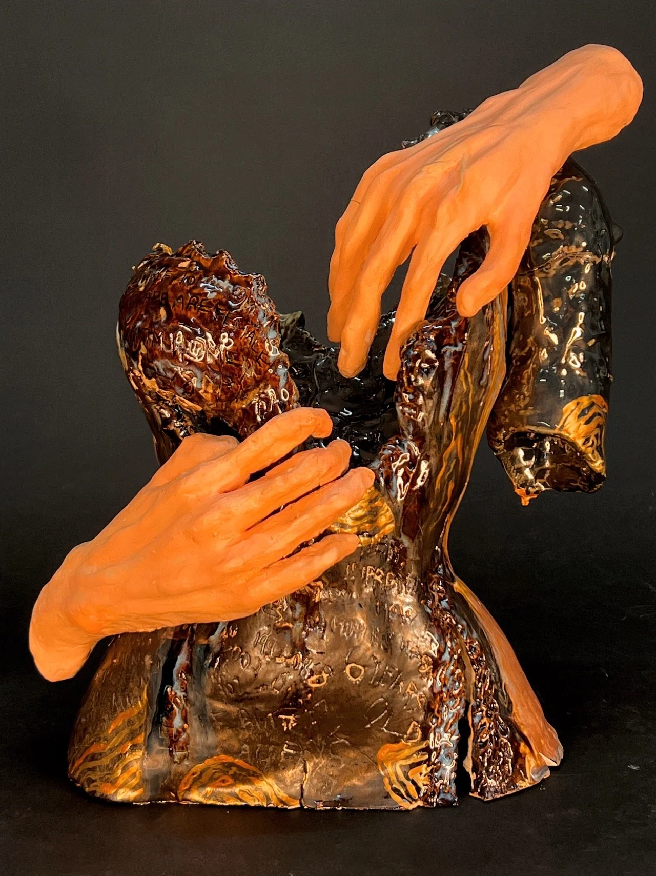
What Were You Wearing?
Ceramic, Glaze | 450mm × 540mm
This sculptural piece is inspired by the "What Were You Wearing?" exhibition, confronting the deeply ingrained issue of victim-blaming. The fragmented, scorched torso represents the emotional and physical scars survivors carry, while the etched quotes of victims serve as raw, unfiltered testimonies of their experiences. The lifelike hands reach out—one grasping, the other shielding—symbolizing both the violation endured and the struggle to reclaim control. The melted textures and dark glaze reflect the pain, erasure, and resilience survivors navigate in the aftermath of trauma.
Inscribed onto the body are the words of survivors, each exposing the cruel reality of misplaced blame:
"I was wearing a t-shirt and jeans. Do you really think it would have mattered?"
"It was my favorite dress. Now I can’t look at it without feeling broken."
"I was wearing my ballet leotard and tights. It was just practice."
"A tennis skirt and polo. Like every other match before."
Through this piece, I aim to challenge the notion that clothing plays a role in consent, underscoring that what someone wears is never an invitation. This work serves as a reminder of the resilience of survivors and a call to shift the conversation away from blame and toward justice.